DesignerHQ design research
Research on the marketing site of designerhq.app, "the new standard for modern design studios". Designer HQ is a studio operating system for design studios of one to five people. It covers projects, tasks, calendar, client rooms, proposals, contracts, invoices, Brand Hubs and an MCP connection for Claude, ChatGPT and Cursor. Nonstop Branding Limited (UK, company 16634111) builds it. Nonstop is a branding agency, and the product is dogfooded on its own client work (the demo client "Bloom" appears everywhere).
Captured on 2026-11-21 at 1440×900, plus 390 px and 768 px widths. Every value was read from the live DOM with getComputedStyle, the stylesheet rules, document.fonts, timed polling in the page, or screenshot pixels. Pixel estimates are marked ≈.

The site in one paragraph
A dark, product-led one-pager. It runs on a Vercel-Geist-style token system: text-heading-64, text-copy-16, ds-gray-100…1000, --background #0b0b0b, --foreground #eee. The class names (lin-bar, lin-wrap) and the layout borrow from the same school as linear.app. One sans (Geist, variable 100–900, set at 510 for headings and 450 for copy) does every job. There is no accent colour: hierarchy comes from gray steps (#ededed → #a0a0a0 → #8f8f8f → #6b6b6b). The art is the product itself. Every section holds a live, scripted HTML mock of the app, with multiplayer cursors, a coral asterisk "AI" avatar, and a demo agency called Nonstop serving a client called Bloom. Colour enters only through client work inside the mocks: moodboards, a coral bridge illustration, lime and orange folders. Motion is a blur-and-rise headline, a word that rotates every 3 s (design → think → plan → create → work), a 50 s logo ticker, and cursors that perform tasks.
Key numbers
| Token |
Value |
| Page background |
#0b0b0b (legal pages #121212) |
| Card surface |
#060606 (--card), tiles #0b0b0b on a rgba(255,255,255,.08) 1 px hairline grid |
| Heading colour |
#ededed (16.8:1) |
| Body colour |
#a0a0a0 ds-gray-900 (7.5:1) |
| Primary button |
#eeeeee fill, #111 text, 12 px radius, 36 px tall |
| Font |
Geist Variable, headings 510, copy 450, labels 450–500 |
| Type scale (px) |
64 · 56 · 48 · 40 · 36 · 32 · 24 · 20 · 18 · 16 · 14 · 13 · 12 |
| Heading tracking |
−0.03em (64/48), −0.96 px at 24, −0.4 px at 20 |
| Container |
1284 px (lin-wrap, 78 px gutters at 1440), 344 px at 390 |
| Section padding |
264 px top (pt-66), 128 px on phones |
| Radius |
12 px buttons and cards, 8 px panels, 6 px chips, 999 px pills |
| Motion tokens |
80 ms micro · 150 ms colour · 250 ms fast · 300 ms panel · 400 ms slow, cubic-bezier(.22,1,.36,1) |
Contents
Captured pages
/, /terms, /privacy, /dpa, /security at 1440. Phone (390 px): home, security, the top of home, and the open menu. Tablet (768 px): home. Hero entrance frames, FAQ open state, and 11 viewport shots with sticky elements in place.
Scope notes
- The site has no blog, changelog, docs, customers or careers pages. Those paths redirect to
/login (307) or / (302). The page templates are therefore the one-page home, the legal template (3 samples) and the Security page.
robots.txt allows crawlers only on /, the four legal pages and asset folders. /login and /client-login are listed in Public pages but were not captured.- The home markup also contains a hidden Free plan variant ("Start for free", a Free column, extra FAQ answers). It was not shown in any captured viewport. The docs describe what renders.
- Two stacks: the home page is Astro (
/_astro/, astro-island, Lenis smooth scroll). The legal pages are Next.js (/_next/, next/font Geist).
- Full-page images are stitched from 900 px viewport tiles. The fixed nav is hidden after the first tile. Sticky elements are hidden, except the pricing header, which is un-stuck. The sticky scroll-spy list and the sticky Claude window are shown in separate viewport shots (
images/home/vp-*.png).
Public pages
Every public URL found on designerhq.app: 24 links in 5 groups. Found on 2026-11-21.
How the list was built
sitemap.xml lists one URL: /.robots.txt allows crawlers only on /, /terms, /privacy, /dpa, /security, and asset folders (/_astro/, /designerhq/, /fonts/, /cta/). User-triggered AI fetchers (Claude-User, ChatGPT-User and others) are also allowed on /brand, /*/hub and /b/ (shared Brand Hub links). Everything else is Disallow: /.- Header, footer, and the legal-page nav supplied the rest.
- Probed paths that are not public:
/blog, /pricing, /about, /docs, /help, /careers, /brand, /llms.txt all return 307 to /login. /changelog and unknown paths return 302 to /.
- There is no blog, changelog, docs, customers or careers page. The marketing site is one long page plus four legal pages.
Captured
Only robots-allowed paths were captured: /, /terms, /privacy, /dpa, /security. /login, /client-login and /third-party-notices.txt are listed but were not screenshotted, because robots.txt disallows them.
Marketing (one-page site) (8)
Legal and trust (5)
Sign-in and sign-up entry points (6)
Machine-readable (2)
Off-site (3)
01 · Design principles
Seven principles are visible in the build. Each one has the evidence it rests on and the reason it suits a tool sold to design studios.
1. The product is the illustration
Every section after the hero holds a live HTML mock of the app, not a screenshot or an illustration: Tasks board, Calendar, timeline, review canvas, forms, moodboards, proposal deck, contracts, invoice, Brand Hub, Library, Claude window, Skills settings, white-label browser and inbox. They are DOM elements with real text and data (wire-tile, agx-app, cl-bar), and scripts move cursors through them.
Why: the buyer is a designer, and designers distrust marketing illustrations. Real, crisp UI at retina sharpness proves the product exists and shows its detail level. HTML mocks also stay sharp at every width and can be animated without video weight.
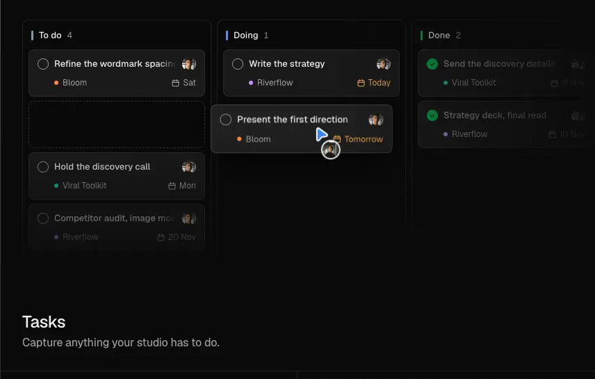
2. Gray does the hierarchy, colour belongs to the client's work
There is no brand accent. Text runs through four gray steps: #ededed (headings), #a0a0a0 (copy), #8f8f8f/#999 (meta), #6b6b6b (fine print). Colour appears only inside the mocks, as client artefacts: moodboard photos, a coral 3D bridge, lime/orange/graphite folders, the Bloom brand hub, and status colours (#fc997f "Today", #33cd70 "Signed by both").
Why: a studio OS has to frame other people's brands. A neutral shell lets every studio's work look right inside it. The marketing page shows this by letting Bloom's colours be the only colour.
3. One family, two weights
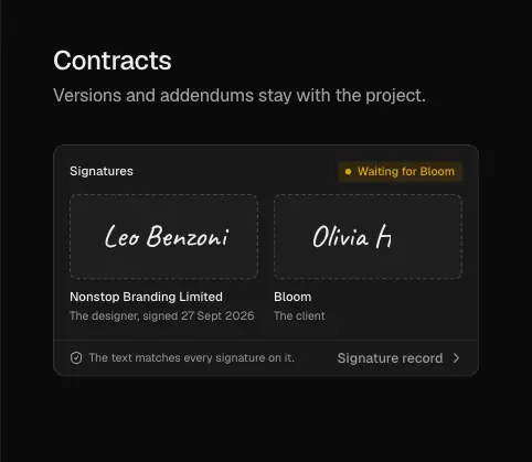
Geist Variable sets every word. Headings use 510, copy and labels use 450, buttons and UI labels use 500. There is no serif, no mono for show, and no italics. (The demo signatures use Caveat, which belongs to the mock.)
Why: 510/450 is the "slightly heavier than regular" pairing used by Linear and Vercel. On dark backgrounds it reads as confident without the blotchiness of 600–700 white text.
4. Linear-school structure
The class names lin-bar, lin-wrap and lin-bar-line, the 64 px nav with a 5 % hairline, the 1284 px wrap, the 264 px section rhythm, the two-column "H2 left, lead right" section intros, and the hairline bento all follow the linear.app layout grammar.
Why: the target user already trusts that grammar from the tools they use, so the product reads as "serious software" before a word is read.
5. Show multiplayer and AI as people, not features
The hero headline has two cursors parked on its rotating verb: a violet pointer and a coral asterisk avatar (the "agent"). Every mock contains named avatars (Leo, Olivia Hart, Jack Watson) and AI responses inside Claude/ChatGPT/Cursor windows.
Why: the positioning is "Where teams, clients and agents design together". Cursors and avatars turn three nouns into visible collaborators.
6. Calm motion with a timeline
Motion is tokenised (--duration-micro 80ms … --duration-very-slow .5s, --ease-smooth-out cubic-bezier(.22,1,.36,1)). The hero has its own clock: words rise in at 0.55 s, the sub at 0.95 s, and the app at 0.78 s, all scaled by --hero-pace (0.54). Reduced motion turns these off (.hero-in … animation: none).
Why: one tempo across the page reads as one product. Fast UI motion (≤ 250 ms) keeps the mocks feeling like software, not a video.
7. Plain-spoken, outcome-first copy
Headlines are short claims ("Your whole studio, connected", "Skip the paperwork scramble."). Captions are one line in the second person ("Ask what you need. Then kick off the project."). The FAQ answers objections in full sentences, including what happens when you stop paying.
Why: studio owners buy on trust and switching cost. Concrete answers ("Nothing gets deleted") reduce risk better than adjectives.
02 · Color system
All values were read from the computed custom properties on the dark page (html.dark) and from element styles. Contrast ratios are WCAG 2.x, computed from the hex values.
Surfaces
| Token |
Value |
Where |
--background |
#0b0b0b |
Page, nav bar, bento tiles |
--card, --sidebar-background |
#060606 |
App-mock sidebars, cards |
--muted |
#0f0f0f |
Quiet fills |
--secondary |
#161616 |
Secondary button, chips |
--accent / --accent-active |
#1e1e1e / #232323 |
Hover and selected rows |
| Legal page body |
#121212 |
/terms, /privacy, /dpa, /security |
| Bento hairline grid |
rgba(255,255,255,.08) shown through 1 px gaps |
Features bento |
| Footer wordmark fill |
linear-gradient(#191919, #121212 70%), clipped to text |
Giant "Designer HQ" |
The surface ramp is almost flat: #060606 → #0b0b0b → #0f0f0f → #161616 → #1e1e1e. Each step is 1–4 % lighter.
Why: with a near-black ramp, the mocks' own UI chrome separates panels, and the page never looks boxy. The legal pages use a slightly lighter #121212 because long text on pure near-black causes halation.
Lines
| Token |
Value |
Use |
--border, --stroke-soft |
#1f1f1f |
Default 1 px borders (93 elements on home) |
--stroke-divider |
#1c1c1c |
Dividers |
--stroke-strong |
#3a3a3a |
Open FAQ card border |
Nav hairline lin-bar-line |
rgb(255 255 255 / .05) |
Bottom of 64 px nav |
| Alpha hairlines |
rgba(255,255,255,.07–.14) |
Panel edges inside mocks |
Text (gray ramp ds-gray-*, dark values)
| Token |
Hex |
On #0b0b0b |
Use |
ds-gray-1000 / --foreground |
#ededed / #eeeeee |
16.8 : 1 |
Headings, active nav, UI labels |
gray-950 (mix) |
#cecece |
12.4 : 1 |
24 px section leads |
ds-gray-900 |
#a0a0a0 |
7.5 : 1 |
Body copy, captions, nav links |
| measured meta |
#9d9d9d / #999999 |
7.3 / 6.9 : 1 |
Mock meta text |
ds-gray-700 |
#8f8f8f |
6.1 : 1 |
Timestamps |
| measured |
#707070 |
4.0 : 1 |
Times inside mocks (fails AA for small text) |
ds-gray-650 |
#6b6b6b |
3.7 : 1 |
"a month" under prices (fails AA at 13 px) |
| Legal body |
#959595 on #121212 |
6.25 : 1 |
Legal paragraphs |
| Legal headings |
#ffffff on #121212 |
18.7 : 1 |
Legal H1/H2 |
Buttons
| Button |
Fill |
Text |
Contrast |
Hover |
| Primary |
#eeeeee |
#111111 |
16.3 : 1 |
fill at 90 % alpha (oklab(.949 0 0 / .9)) |
| Secondary |
#161616 |
#eeeeee |
15.6 : 1 |
#1c1c1c |
| Nav link |
none |
#a0a0a0 |
7.5 : 1 |
#ededed |
Status and accent hues (inside mocks only)
| Role |
Value |
Contrast on #0b0b0b |
| "Today" / design phase (coral) |
#fc997f |
9.4 : 1 |
| "Shared" / "Signed by both" (green) |
#33cd70 |
9.5 : 1 |
| Calendar event fill (navy) |
color(srgb .139 .195 .293) ≈ #23324b |
n/a (fill) |
| Design phase fill (brown) |
color(srgb .218 .123 .098) ≈ #381f19 |
n/a (fill) |
| Palette for tags |
--hue-{red,pink,violet,blue,amber,cyan,green,teal,rose,slate,indigo,lime,sky,fuchsia,purple}-{base,text} (Tailwind 500 base / 400 text) |
|
| System colours |
ds-blue-700 #006efe, ds-red-700 #f13242, ds-amber-700 #ffae00, ds-green-700 #00ac3a |
|
Why: the hue tokens exist for project tags inside the product. The marketing page uses them sparingly, so each coloured chip reads as data, not decoration.
Light theme
The token file also defines a light theme (--background #fbfbfb, ds-gray-1000 #1c1c1c, --border #e4e4e4, --primary-accent #000). It belongs to the product. The marketing page is locked to html.dark with color-scheme: dark and does not switch with the OS theme.
Shadows
On dark, --shadow-raise is 0 1px 2px #0006, 0 2px 8px #00000038 and --shadow-overlay is 0 4px 12px #00000073, 0 8px 32px #0000004d. Floating mocks use rgba(0,0,0,.45) 0 24px 64px, rgba(0,0,0,.3) 0 4px 16px. Avatars get a 2 px ring in the page colour (0 0 0 2px #121212) so they cut out of each other.
03 · Typography
Families
| Family |
Where |
Source and licence |
Free substitute |
| Geist (Variable, 100–900) |
Every word on the marketing and legal pages |
Vercel, with Basement Studio. Free, SIL Open Font License. Self-hosted at /fonts/geist/Geist-Variable.woff2 (home) and through next/font (legal pages). Get it from vercel.com/font or the geist npm package. |
It is free. The nearest alternatives are Inter (OFL) and Manrope. |
Signature (Caveat 500, subset Caveat-500-signatures.woff2) |
The two signatures in the Contracts mock ("Leo Benzoni", "Olivia Hart") |
Caveat by Impallari Type, OFL, on Google Fonts |
It is free. Alternatives: Homemade Apple, Reenie Beanie. |
Bloom Display / Bloom Manifold (800, .otf under /demo/a/) |
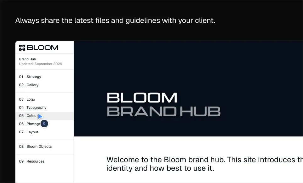
Only inside the Bloom Brand Hub mock ("BLOOM BRAND HUB", "05 COLOUR") |
A demo client's brand face, self-hosted for the mock. The foundry is not shown. |
A wide geometric display: Unbounded or Syne ExtraBold. |
ui-monospace, SFMono-Regular, Menlo… |
--font-mono. Declared, rarely visible |
System |
n/a |
On legal pages the stack is greek, geist, "geist Fallback", system-ui. greek is a unicode-range face for Greek glyphs and stays unloaded for English text, so Geist renders.
Why Geist: it is the house face of the token system the site copies (Vercel Geist). It has a large x-height and tight default spacing for UI, and its variable axis allows the in-between weights 450 and 510 that this site depends on.
Weight system
| Weight |
Use |
510 (--heading-weight, overrides the token default 580) |
All headings H1–H3 |
| 450 |
Body copy, captions, labels (text-copy-*, text-label-*) |
| 500 |
Buttons, nav CTA, UI labels inside mocks |
| 400 |
FAQ questions as H3 (rendered 16/24), long legal links, mock meta |
| 600 |
Footer wordmark (256 px), legal-page logo (14 px) |
| 700 |
Mock document numbers ("027") |
Why 510 instead of 600: white type on near-black looks heavier than it is (irradiation). Dropping from 600 to 510 keeps headings crisp and avoids a "bold marketing" look. 450 body is a hair heavier than 400 for the same reason: thin 400 gray on black breaks up at 14–16 px.
Measured scale (desktop 1440)
| Role |
Size / line-height |
Weight |
Tracking |
Colour |
Example |
| H1 hero, closing CTA |
64 / 64 |
510 |
−1.92 px (−0.03em) |
#ededed |
"Where teams, clients and agents design together." |
| H2 section |
48 / 52 |
510 |
−1.536 px (−0.032em) |
#ededed |
"Your whole studio, connected" |
| Footer wordmark |
256.1 / 256.1 |
600 |
−10.24 px (−0.04em) |
gradient clip |
"Designer HQ" |
| H3/H4 tile title |
24 / 30 |
510 |
−0.432 px (−0.018em) |
#ededed |
"Tasks", "Forms", "A spare hand everywhere you need one" |
| Plan name |
24 / 32 |
510 |
−0.384 px |
#ededed |
"Core", "Studio" |
| Section lead (right column of each intro) |
24 / 32 |
450 |
0 |
#cecece (gray-950 = 60 % #ededed + #a0a0a0, 12.4 : 1) |
"Plan every project, track every task…" |
| Hero lead |
18 / 27 |
450 |
0 |
#a0a0a0 |
"Designer HQ is the simplest way to run a design studio…" |
| Tile caption |
16 / 25 |
450 |
−0.176 px |
#a0a0a0 |
"Capture anything your studio has to do." |
| FAQ question |
16 / 24 |
510 (button) |
0 |
#ededed |
"Who is Designer HQ for?" |
| FAQ answer |
14 / 22 |
400 |
0 |
#a0a0a0 |
|
| Button |
14 / 20 |
500 |
0 |
#111 / #eee |
"Pick your plan" |
| Nav link |
14 / 20 |
450 |
0 |
#a0a0a0 |
"Features" |
| Ticker handle |
14 / 20 |
500 |
−0.2 px |
#a0a0a0 |
"jackwatsondesigns" |
| Small print |
13 / 20 |
450 |
−0.13 px |
#a0a0a0, #6b6b6b |
"Bigger than 15?", "a month" |
| Mock UI text |
13 / 18, 12 / 16–18 |
400–500 |
0 |
#ededed, #8f8f8f–#999 |
task titles, times |
Token names (from the stylesheet)
text-heading-{72,64,56,48,40,36,32,24,20}, text-copy-{18,16,14}, text-label-{14,13,12}. Defined line-heights: 64→64, 56→56, 40→48, 36→40, 32→40, 24→32, 20→26, copy 18→28, 16→24, 14→20, labels 14→20, 13→16, 12→16. Headings ≥ 32 use −0.03em; 24 uses −0.96 px; 20 uses −0.4 px.
Responsive scale
| Width |
H1 |
H2 |
Body |
| 1440 |
64 / 64, −1.92 px |
48 / 52 |
16 / 25 |
| 768 |
54.5 / 54.5, −1.64 px (fluid between heading-56 steps) |
40 / 44, −1.2 px |
16 |
| 390 |
36 / 40, −1.08 px |
22 / 28, −0.26 px |
16 |
Why: the H2 drops more than the H1 on phones (48 → 22, about 46 %), so section titles turn into labels and the mocks take the visual weight.
Legal pages (Next.js template)
| Role |
Size / line-height |
Weight |
Tracking |
Colour |
| H1 |
32 / 40 |
450 |
−1.28 px (−0.04em) |
#fff |
| H2 |
20 / 26 |
450 |
−0.4 px |
#fff |
| Body |
14 / 23.1 (1.65) |
450 |
0 |
#959595 |
| Inline bold lead-ins |
14 / 23.1 |
500 |
0 |
#fff |
| Links |
14 / 23.1 |
400–450 |
0 |
#fff |
| Legal nav |
13 / 16 |
450 |
0 |
#959595 |
Why: a 1.65 line-height and 721 px measure (≈ 95 characters at 14 px) make dense legal text scannable. White links in gray paragraphs act as the only emphasis.
Details
text-balance on headings, text-pretty on leads.antialiased on <html> (grayscale smoothing on macOS). This keeps light-on-dark text thinner.- Headline lines are split into
.hero-tl spans so each line can animate in on its own. A screen-reader copy sits in .sr-only.
- Numbers in pricing are 48 px figures at 510 ("$49", "$149") with a 13 px
#6b6b6b "a month".
04 · Layout, grid and spacing
Container
.lin-wrap: 1284 px wide at 1440 (x 78 → 1362). Gutters 78 px. At 768: 700 px (x 34). At 390: 344 px (x 23).- Tailwind spacing base
--spacing: .25rem (4 px). Classes like pt-66 = 264 px.
- Legal pages use a single 721 px column at x 359 (centred on 1440).
Why 1284: wide enough for 3-up bento tiles of 427 px with full-size app chrome inside them. That is close to linear.app's 1280–1344 px wrap.
Vertical rhythm
| Section |
Top y |
Height |
Top padding |
#top hero |
64 |
1336 |
199 px at ≥1025 (91 at ≥641, 66 phone) |
#features |
1400 |
1796 |
264 (sm:pt-66), 128 phone |
#clients |
3196 |
4055 |
264 |
#ai |
7251 |
2382 |
264 |
#your-name |
9633 |
1113 |
264 |
| Pricing island |
≈10746 |
≈2050 |
≈264 |
| FAQ island |
≈12800 |
≈1125 |
≈264 |
#cta |
13925 |
732 |
264 top and bottom |
| Footer |
14801 |
538 |
56 px, 1 px #1f1f1f top border |
Total height 15,339 px at 1440, 14,228 at 390, 15,448 at 768.
Why 264 px: a very large gap (≈ 4× the H2 size) makes each section read as a separate "screen" in the scroll. It also leaves room for the scroll-reveal before the next mock arrives.
Section intro grid
Every section starts with the same two-column intro: H2 at the left (542 px wide, 2 lines), and a 2–3 line lead (566 px wide) starting at x 752, top-aligned with the H2. The gap between them is 132 px. The pattern holds for "Your whole studio, connected", "One room…", "Connect your agents…" and "A white label OS…". FAQ and the closing CTA centre their heading. Pricing puts "Pricing" at the left edge of its 960 px table (x 240).

Bento (.wire-bento)
grid-template-columns: 427.33 427.33 427.34, grid-template-rows: 5 × 272 px, gap 1 px. The grid background rgba(255,255,255,.08) shows through the gaps as hairlines.border-radius 12px; overflow: hidden on the grid, so the outer corners are rounded and the inner corners are square.- Tile sizes by
data-size: wide (2×2), tall (1×2), long (2×1), cell (1×1). Layout: wide+tall / tall+wide / long+cell. This alternates the heavy tile left and right.
- Tile padding 24 / 32 / 28 px. The text sits at the bottom (
justify-content: flex-end).
- Phone: one column (344 px). Tablet: 3 × 232.7 px.
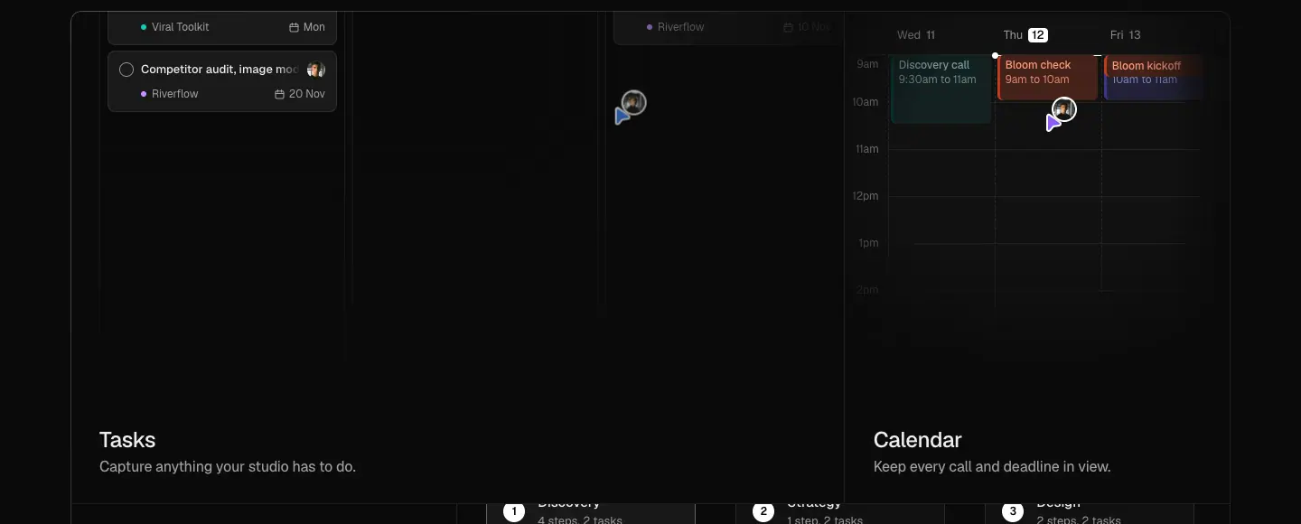
Why hairline gaps instead of card borders: one continuous sheet with 1 px seams reads as a single product surface, not a collection of cards. It is also cheaper visually than 12 separate borders.
Clients section: sticky scroll-spy
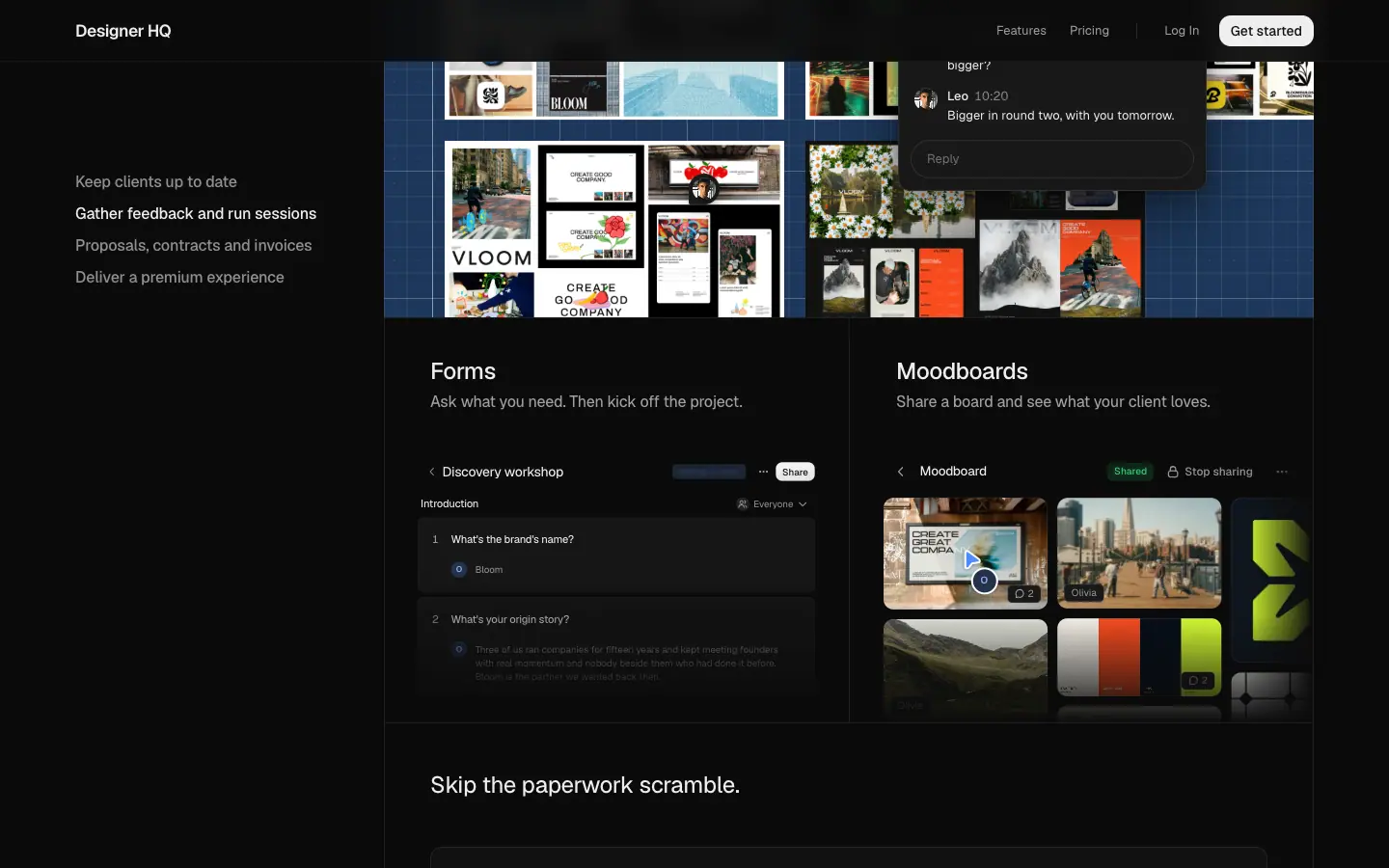
Left column: a sticky nav.wire-dive-list (top: 128px, 320 × 502) with four items. Right column: a stack of 964 px wide panels (x 398 → 1362) that scroll past. The active item turns #ededed, and the rest stay #a0a0a0.
AI section: sticky window
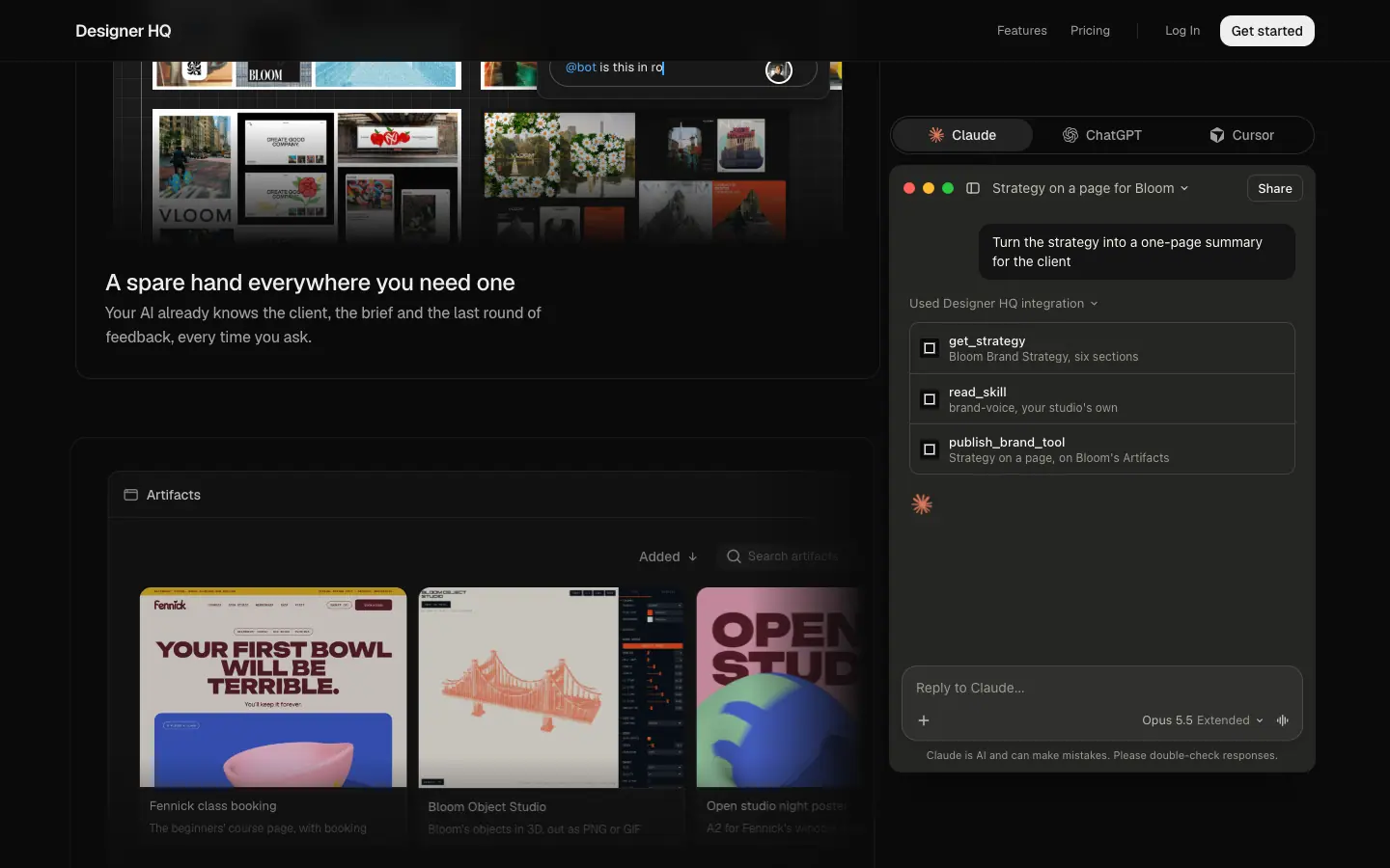
The left column holds three text-and-mock blocks (520 px text column, px-5 pt-6 pb-5). The right column is a sticky aside.wire-aside (top: 120px, 440 × 680) holding a Claude/ChatGPT/Cursor window whose conversation changes with the active block.
Pricing table
A 960 px comparison grid (x 240 → 1200): a 392 px feature column plus two 235 px plan columns with ≈ 70 px between them. The plan header row (dhq-cmp-head) is position: sticky; top: 63px, so plan names and buttons stay visible while the feature rows scroll.
FAQ
An 820 px centred column (x 310). Items are separate 12 px-radius cards with 8 px gaps and a 1 px #1f1f1f border. The open card's border turns #3a3a3a.
Breakpoints (from classes)
min-[641px], min-[1025px], sm, lg. The hero switches headline line-splitting (hero-tl-phone vs hero-tl-wide) at 641 px. The nav collapses to a Menu button below ≈ 1025 px.
05 · Heroes
The site has one hero (home). The closing CTA repeats its type at the bottom. The legal pages have a plain title header.
Home hero (y 64 → 1400)
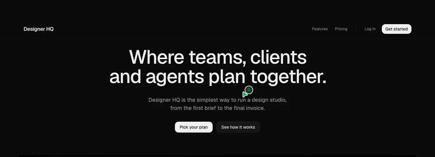
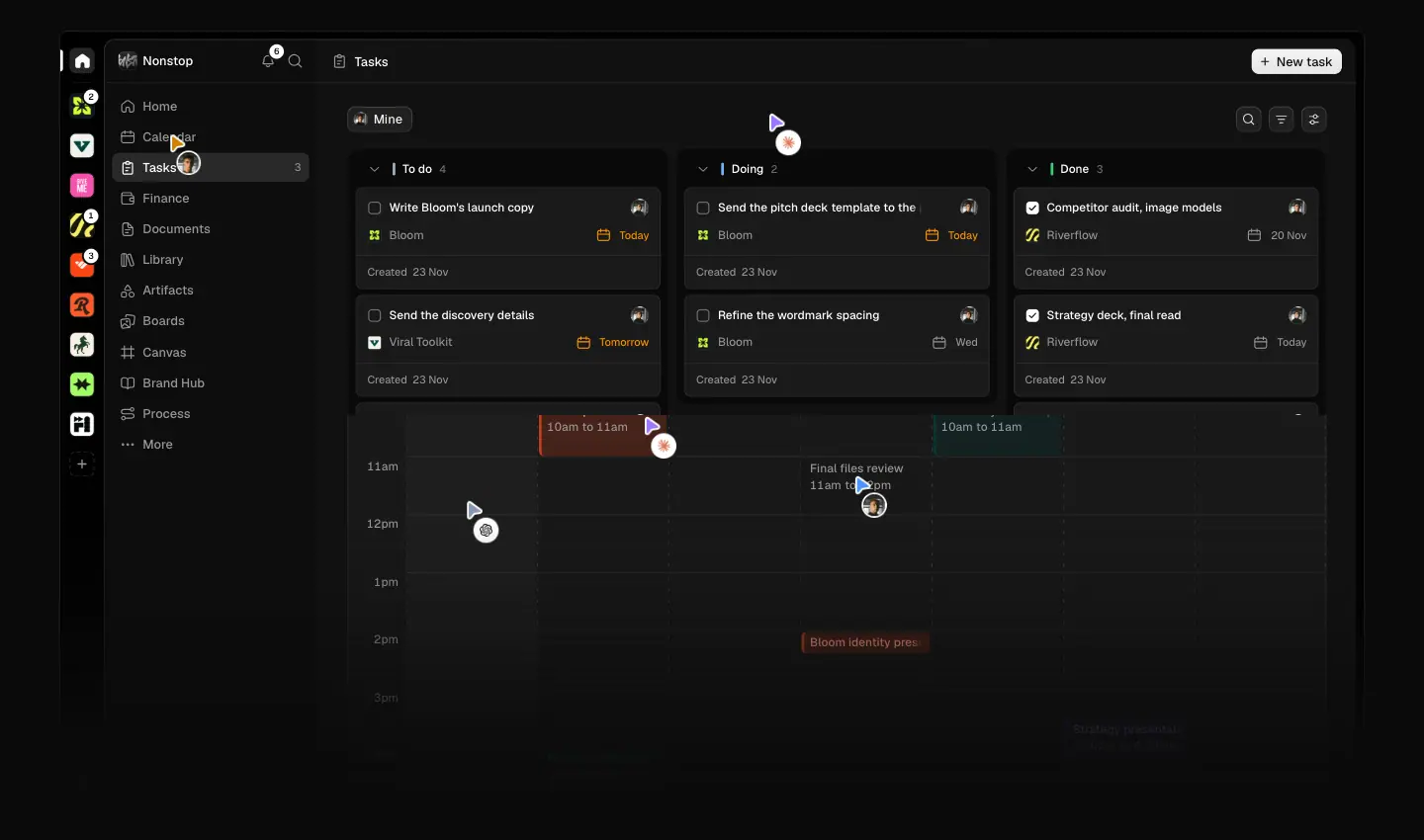
| Part |
Measured |
| Top padding |
199 px at ≥ 1025 (H1 top at y 157) |
| H1 |
64/64 Geist 510, −1.92 px, #ededed, centred, 2 lines, 1284 px box, text-balance |
| Rotating verb |
data-turn = ["design","think","plan","create","work"]. Swaps every ≈ 3.0 s with a ≈ 0.4 s width-and-letter transition |
| Cursors on the verb |
violet pointer plus a ≈ 28 px white disc holding a coral asterisk (the agent), parked at the word's right edge |
| Lead |
18/27 450 #a0a0a0, 457 px wide, 2 lines, text-pretty |
| Buttons |
"Pick your plan" (primary #eee, 125 × 36, radius 12) and "See how it works" (secondary #161616, 146 × 36). 12 px gap |
| Product frame |
starts y ≈ 510: a 1320 px app window (x 60 → 1380) with a rail of client logos, the "Nonstop" studio sidebar, and a Tasks board with To do / Doing / Done columns |
| Ground |
.hero-nebula (fixed, masked transparent 0 → #000 40% → transparent 66%) and a dotted texture radial-gradient(rgba(255,255,255,.05) 1px, transparent 1.4px) around the frame |
| Ticker |
"Trusted by" plus 7 studio Instagram handles with avatars, at y ≈ 1340 |
Entrance sequence (from the CSS tokens, × --hero-pace 0.5405)
- Headline lines rise 20 % and un-blur from 6 px: line 1 at 0.55 s, line 2 at 0.55 + 0.145 s, each lasting 1.25 s. Effective times are 0.30 s, 0.38 s and 0.68 s long.
- App frame fades in at 0.78 s for 1 s (effective 0.42 s / 0.54 s), with a "shine" that climbs then settles (
hero-shine-climb, hero-shine-settle).
- Lead rises 9.6 px (4.8 px at some widths) at 0.95 s (effective 0.51 s).
- The demo starts: cursors move cards across the board, then the app navigates to Calendar.
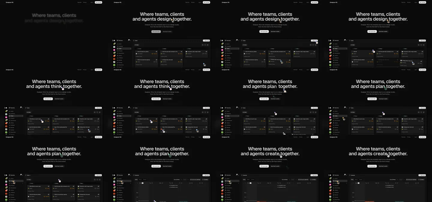
Why:
- The verb rotation lets one headline cover the whole product (design, think, plan, create, work) without a feature list.
- The cursors on the verb make "teams, clients and agents" literal: people and an AI are pointing at the same word.
- The product frame starts at 510 px, inside the first 900 px viewport. The value is visible without scrolling.
- Blur-to-sharp entrance on dark is soft. There is no bounce or slide, which fits a "calm studio" tone.
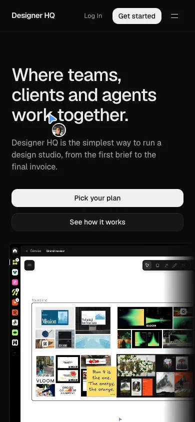
Phone hero (390)
H1 36/40, hero-tl-phone lines with a 0.33× word step. 66 px top padding. Buttons stay side by side. The app frame shows the sidebar rail and a clipped board.
Closing CTA (#cta)

The H2 uses the H1 style (64/64, −1.92 px), centred: "Give your studio a connected HQ today". One primary "Pick your plan" button. 264 px padding above and below. Why: the same type as the hero closes the loop, and the single button removes choice at the end.
Legal header
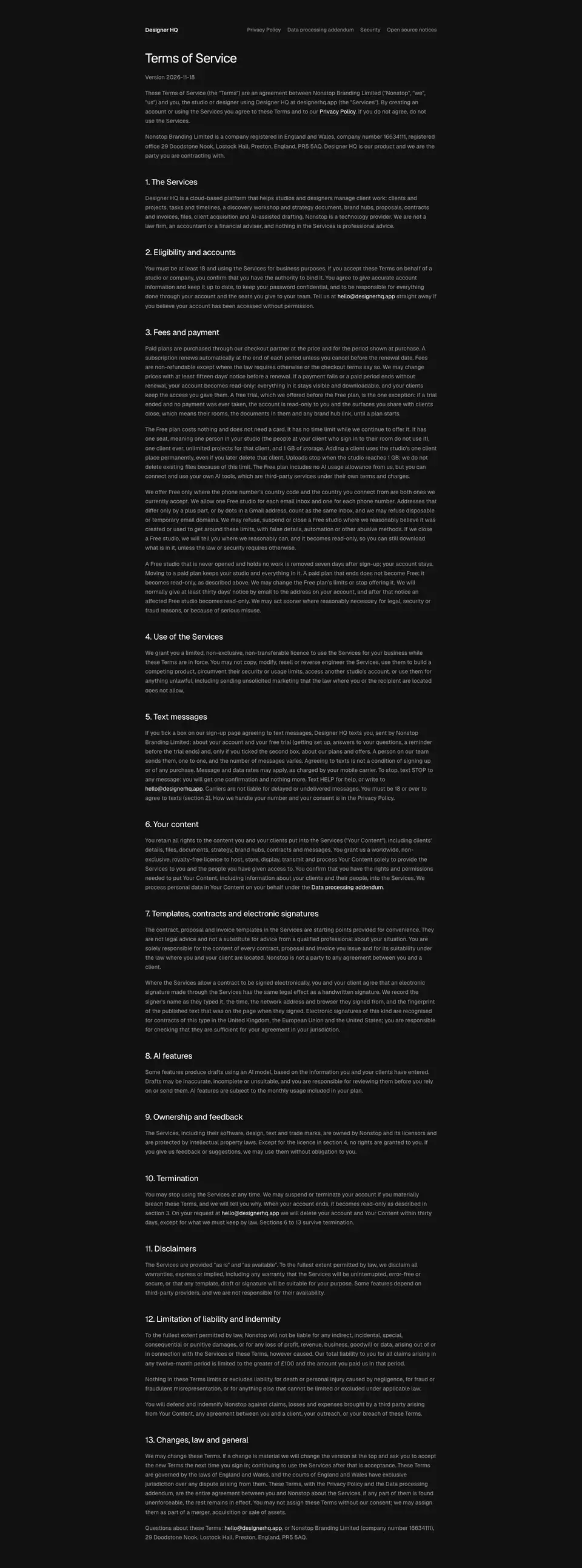
The legal pages have no hero. The 64 px bar holds the logo and a legal nav (13 px #959595). Then: H1 32/40 450 white, a "Version 2026-11-18" line, and the text begins.
06 · Section types
Twelve section patterns appear on the home page. Each has the measured structure and the reason for its use.
1. Centered hero with product frame
H1 + lead + two buttons, centred, over a full-width app window. See Heroes.
2. Logo/handle ticker ("Trusted by")
 A row of 7 studio handles with 24 px round avatars, duplicated for a seamless loop.
dhq-ticker 50 s linear infinite translate(-50%). The edges are masked with linear-gradient(90deg, transparent, #000 6%, #000 94%, transparent).
Why: small studios do not have recognisable logos. Instagram handles with faces are honest social proof for the target size (1–5 people).
3. Two-column section intro
H2 48/52 at the left (542 px), and a 24/32 #cecece lead in the right column. This opens 4 of the 7 content sections.
Why: the reader gets the claim (left) and the proof sentence (right) in one glance, and the layout keeps H2s short.
4. Hairline bento grid
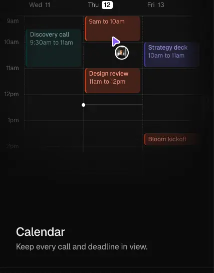
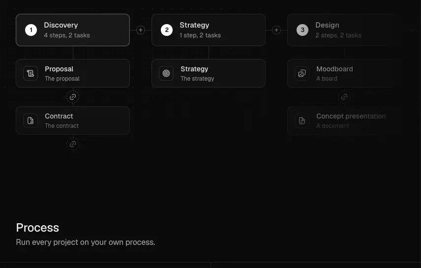
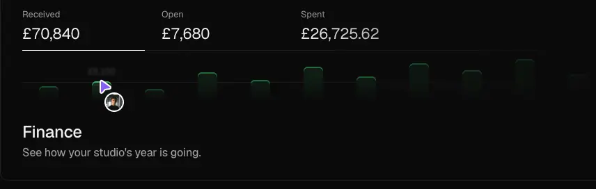
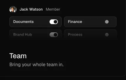
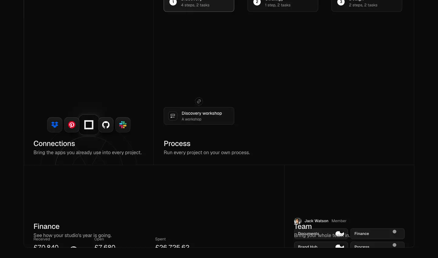 3 columns × 5 rows of 272 px, 1 px gaps on an 8 % white ground, 12 px outer radius. Six tiles: Tasks (wide), Calendar (tall), Connections (tall), Process (wide), Finance (long), Team (cell). Each tile has a mock in the upper area and a 24 px title plus a 16 px caption at the bottom.
Why: one sheet presents "everything in one place", which is the claim of the section ("Your whole studio, connected").
5. Sticky scroll-spy with feature panels
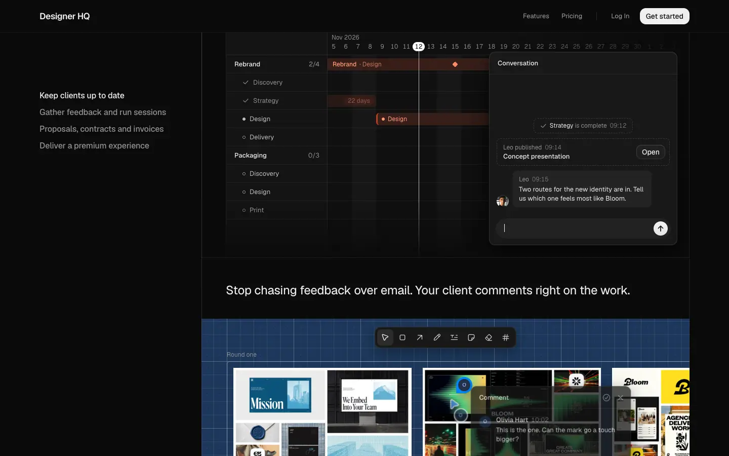 Left: a sticky list of four client-facing jobs ("Keep clients up to date", "Gather feedback and run sessions", "Proposals, contracts and invoices", "Deliver a premium experience"). Right: tall 964 px panels, each a full-width mock plus a 2-up row of smaller mocks with 24 px titles (Forms / Moodboards, Contracts / Invoices, Library / Brand tools).
Why: the client-side story is long (11 sub-features). The sticky list keeps orientation and acts as a table of contents.
6. Text blocks with a sticky product window
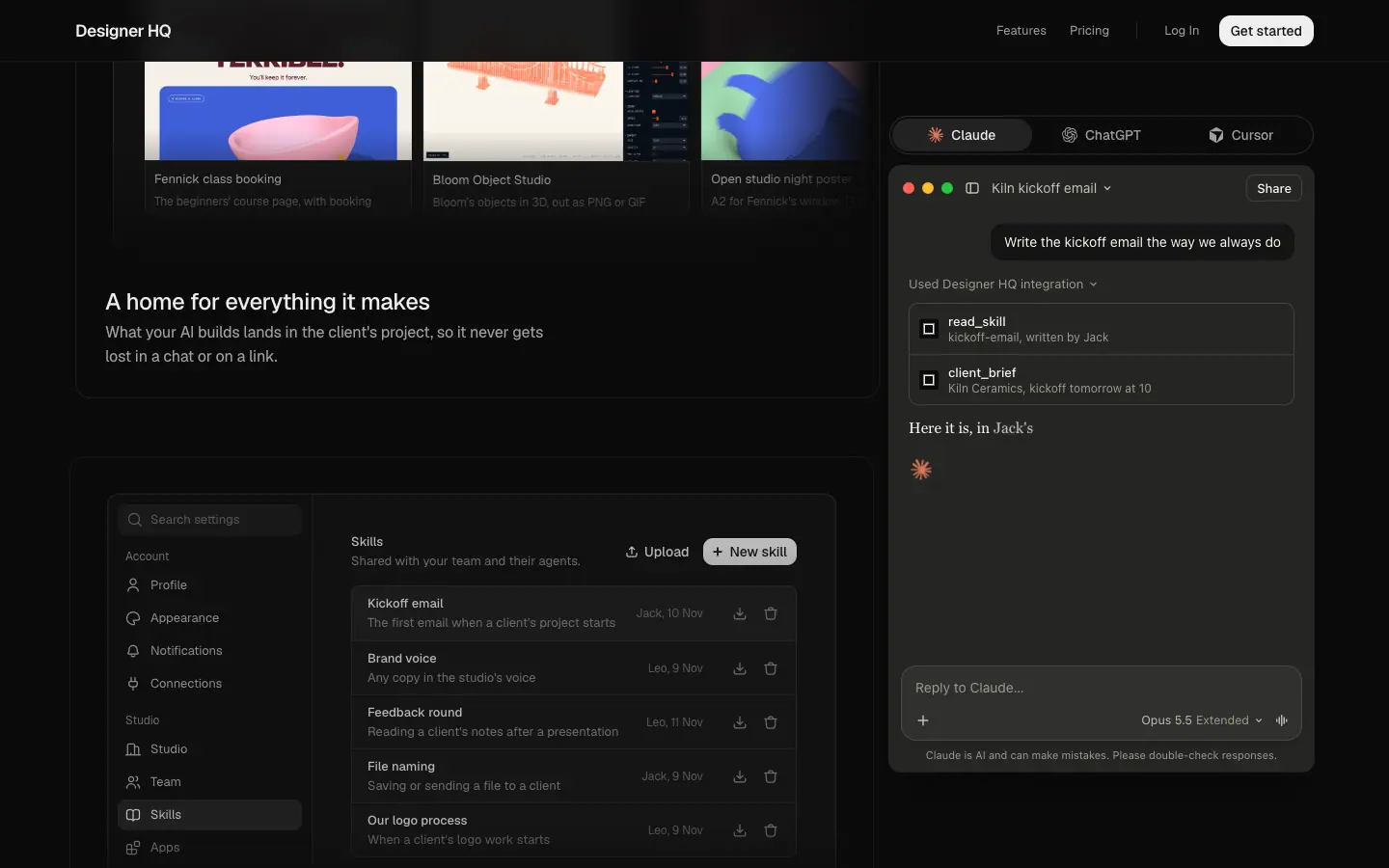 Three blocks on the left ("A spare hand everywhere you need one", "A home for everything it makes", "Share skills across the entire team"), each with a mock of Designer HQ's own UI. On the right, a sticky Claude window shows the matching conversation. Tabs switch between Claude, ChatGPT and Cursor.
Why: it shows the MCP integration from both sides at once: the AI tool (right) and the result in the HQ (left).
7. Asymmetric feature trio
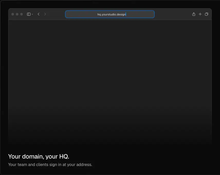
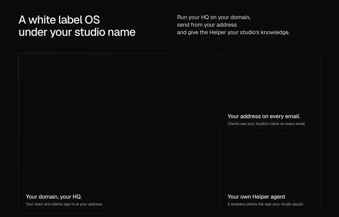 One large tile (856 × 681, "Your domain, your HQ.") next to two stacked tiles (427 × 340 each: "Your address on every email.", "Your own Helper agent"). The bento uses the same hairline construction.
Why: the domain is the main white-label promise, so it gets twice the area. Email and Helper support it.
8. Pricing with a plan header and comparison table
 H2 "Pricing" at the left. A Monthly / Quarterly switch (
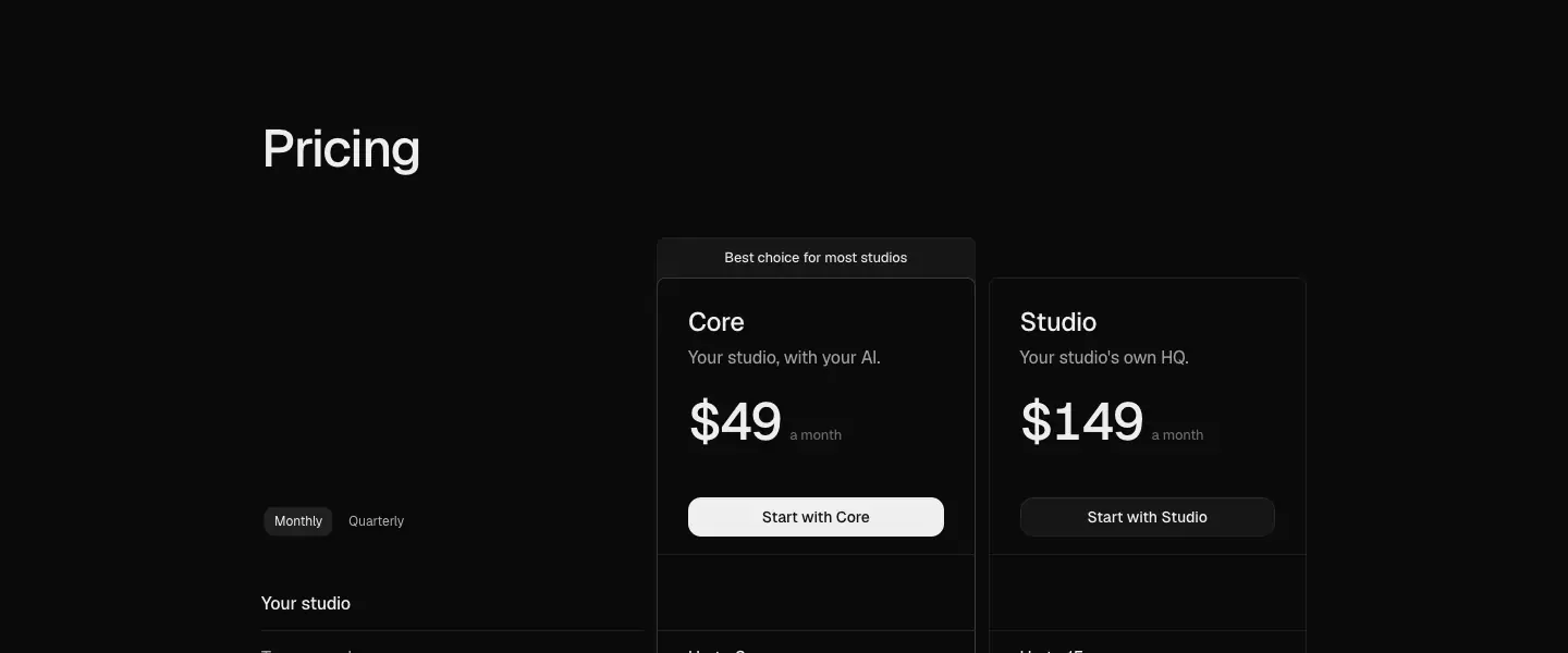
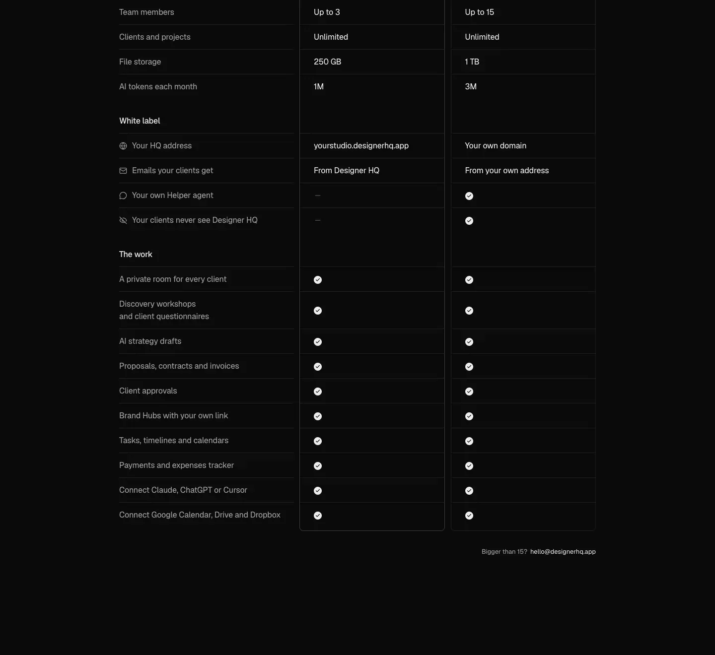
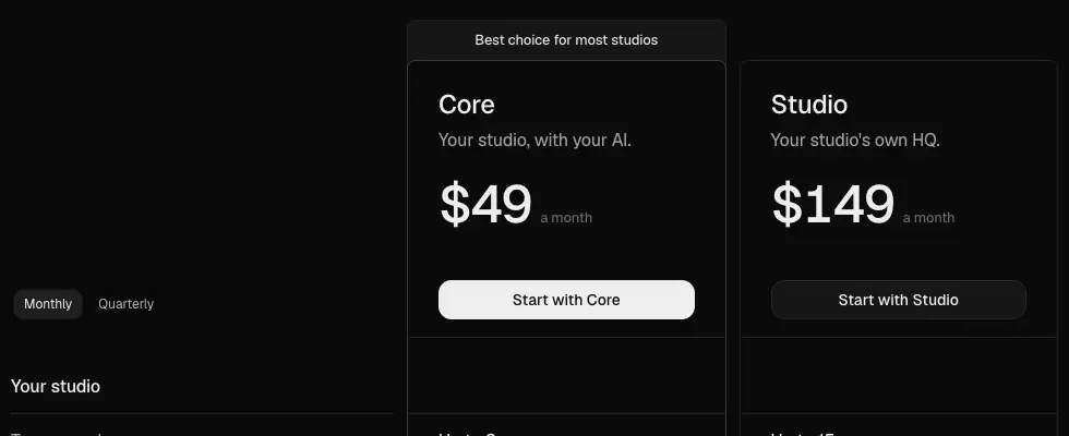
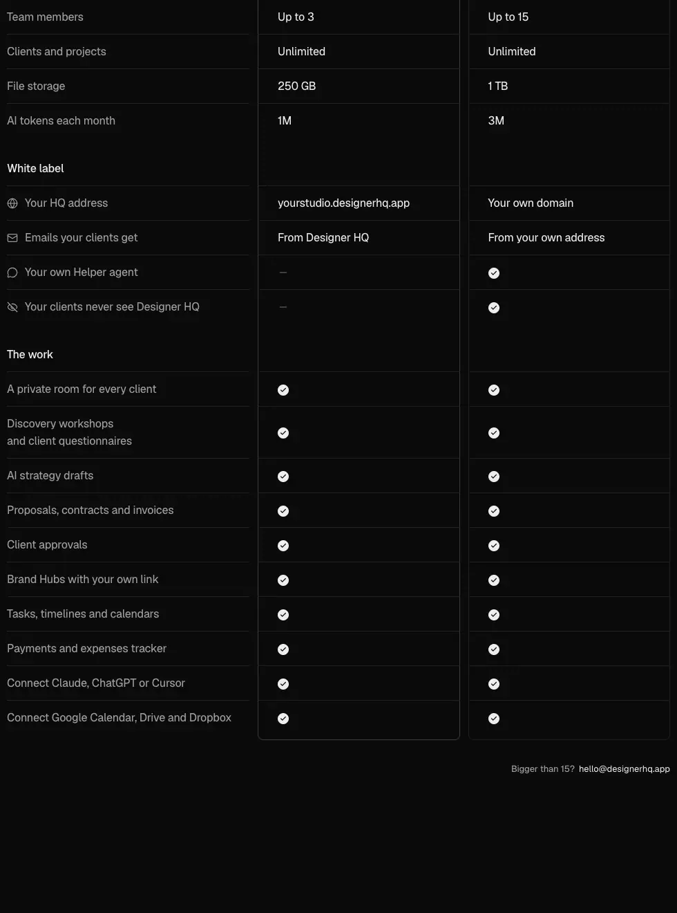
dhq-switcher, 143 × 32, active chip #202020). Two plan columns: Core $49 ("Best choice for most studios" tab above it) and Studio $149. Below, the same columns continue as a comparison table in three groups: Your studio, White label, The work. Rows are 25 px with 1 px dividers. Checks are filled white circles. The footnote reads "Bigger than 15? hello@designerhq.app".
Why: merging plan cards into the comparison table removes the usual jump between "cards" and "compare all features". The sticky header keeps prices visible while comparing.
9. FAQ accordion cards
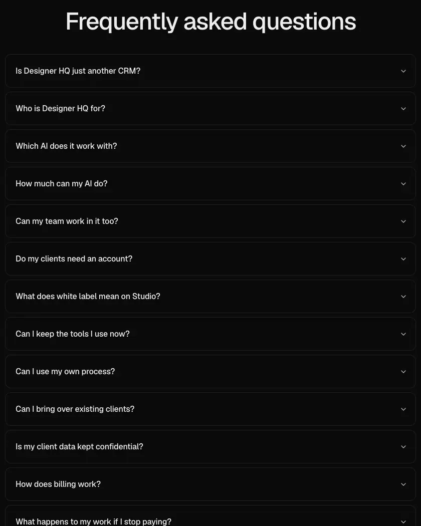
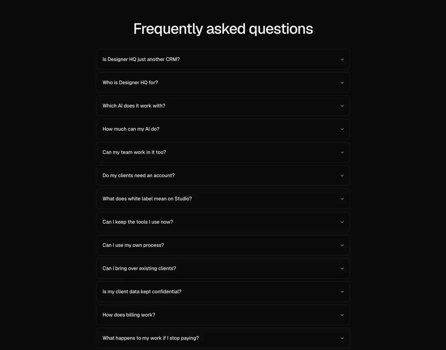 13 questions in 12 px-radius cards with 8 px gaps. The open card gets a
#3a3a3a border. Answers fade and un-blur in.
Why: cards (not hairline rows) give each question a clear hit target. The open border marks state without colour.
10. Closing CTA
Centred 64 px H2 and one button. See Heroes.
11. Footer with giant wordmark
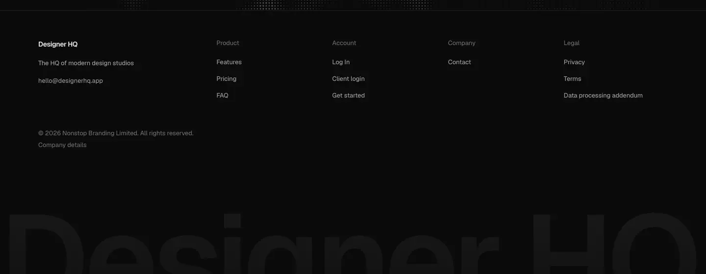 Four link columns, a legal line, and a 256 px "Designer HQ" wordmark bleeding off the bottom edge, filled with a
#191919 → #121212 gradient (1.1 : 1 against the page).
Why: a quiet sign-off. The wordmark is texture, not text to read, and it echoes linear.app and Vercel footers.
12. Legal document
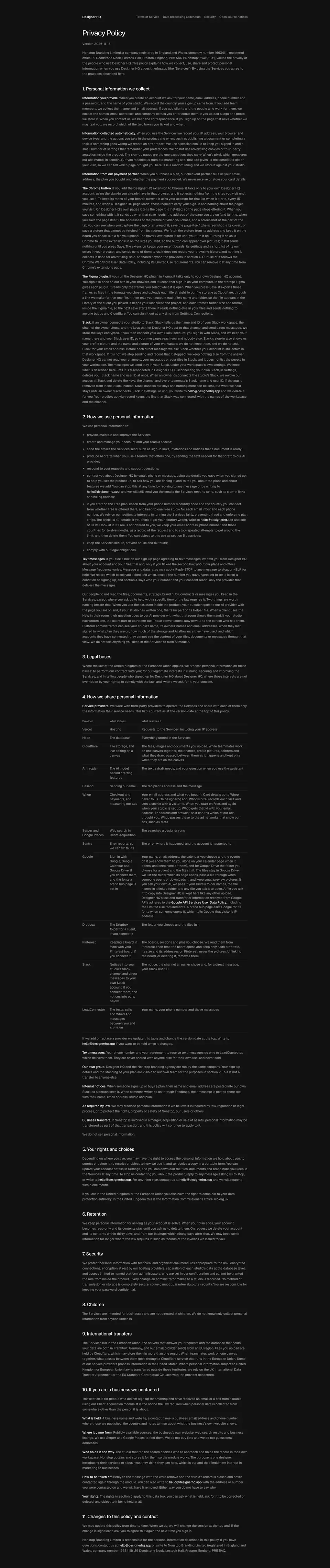 A single 721 px column with a 32 px H1, numbered 20 px H2s, 14/23.1 gray body, and bold lead-ins for definitions. See Legal page template.
07 · Copywriting and voice
Voice in one line
A studio owner talking to another studio owner: short claims, the second person, British spelling ("colour", "centre" in data-words), and no hype adjectives.
Headline system
| Level |
Copy |
Pattern |
<title> |
"Designer HQ: the new standard for modern design studios" |
Category claim |
| H1 |
"Where teams, clients and agents design together." (rotates: think, plan, create, work) |
"Where X, Y and Z [verb] together": three actors, one shared verb |
| Hero lead |
"Designer HQ is the simplest way to run a design studio, from the first brief to the final invoice." |
Product = simplest way + scope from start to end of a job |
| H2 |
"Your whole studio, connected" |
Possessive + outcome, no verb |
| H2 |
"One room for every way you work with clients" |
Metaphor ("room") that matches the product noun |
| H2 |
"Connect your agents to your studio" |
Imperative |
| H2 |
"A white label OS under your studio name" |
Category + benefit |
| H2 |
"Pricing", "Frequently asked questions" |
Plain labels |
| Closing H2 |
"Give your studio a connected HQ today" |
Imperative + name echo ("HQ") |
Why: headlines name the owner's things ("your studio", "your clients", "your agents") 9 times on the page. The product is framed as their space, not a tool.
Leads (right column, 24 px)
- "Plan every project, track every task and connect anything your studio runs on."
- "Share every update, gather every comment and hand over anything your clients need."
- "Connect Claude, ChatGPT or Cursor and it works right inside your studio."
- "Run your HQ on your domain, send from your address and give the Helper your studio's knowledge."
Pattern: three verb clauses in a row (rule of three). Each clause is one feature.
Panel lines (one sentence each)
- "Share every step and message in one place, so your client is never left guessing."
- "Stop chasing feedback over email. Your client comments right on the work."
- "Skip the paperwork scramble."
- "Always share the latest files and guidelines with your client."
Pattern: name the pain ("chasing", "scramble", "guessing"), then the fix.
Tile captions (≤ 8 words)
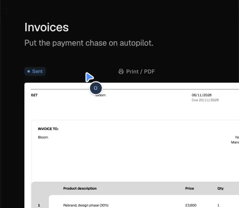
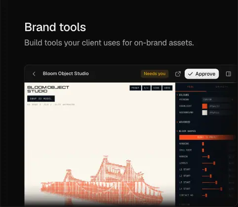
"Capture anything your studio has to do." · "Keep every call and deadline in view." · "Bring the apps you already use into every project." · "Run every project on your own process." · "See how your studio's year is going." · "Bring your whole team in." · "Ask what you need. Then kick off the project." · "Share a board and see what your client loves." · "Versions and addendums stay with the project." · "Put the payment chase on autopilot." · "Hand over every final file in one Library." · "Build tools your client uses for on-brand assets."
Why: each caption is a verb-first job, not a feature name. The tile title carries the noun (Tasks, Calendar…), and the caption carries the outcome.
AI copy
"A spare hand everywhere you need one" / "Your AI already knows the client, the brief and the last round of feedback, every time you ask." · "A home for everything it makes" / "What your AI builds lands in the client's project, so it never gets lost in a chat or on a link." · "Share skills across the entire team" / "Write how your studio works and every agent on the team follows it."
The AI is "a spare hand", never "magic" or "10×". It is framed as staff that follows the studio's rules.
FAQ voice
The FAQ answers objections in full sentences:
- "Is Designer HQ just another CRM?" → "No. Generic tools manage contacts and tasks. Designer HQ is built around how a design studio runs…"
- "What happens to my work if I stop paying?" → "Nothing gets deleted… your studio becomes read only… Pick a plan again and everything is exactly where you left it."
- "Is my client data kept confidential?" → "…Designer HQ never sells your data or uses it to train AI models."
- Pricing in the FAQ: "Core is $49 a month or $129 every 3 months, and Studio is $149 a month or $379 every 3 months… your price stays the same for as long as you stay."
Why: studio owners fear lock-in and client-data leaks. Specific answers ("read only", "code sent to their email") build trust better than badges.
Microcopy
- Buttons: "Pick your plan", "See how it works", "Get started", "Log In", "Start with Core", "Start with Studio". Sentence case except "Log In".
- Ticker label: "Trusted by".
- Pricing: "Best choice for most studios", "Bigger than 15? hello@designerhq.app".
- Footer tagline: "The HQ of modern design studios". The email copies to the clipboard and shows "Copied".
- Demo content is realistic studio work: "Refine the wordmark spacing", "Hold the discovery call", "Competitor audit, image models", "Two routes for the new identity are in. Tell us which one feels most like Bloom." This doubles as copy: it shows the reader their own week.
Legal and Security voice
The Security page is written in plain English, not compliance jargon: "Every studio's clients, projects, files and money are kept apart from every other studio inside the database." "Each person stays signed in on up to three devices." Facts are specific: AES-256, Frankfurt, Neon, Vercel, Cloudflare, "six-digit code", "ten minutes", "three wrong tries".
Why: precise numbers are the trust signal for a small vendor without SOC 2 badges.
08 · Components
Nav bar (.site-bar › .lin-bar)
position: fixed; top: 0; z-index: 40, height --nav-h 64 px, background --background #0b0b0b (opaque). A 1 px rgb(255 255 255 / .05) hairline (lin-bar-line) sits at the bottom. A hidden blurred layer (bg-(--background)/93 backdrop-blur 12px) exists for a scrolled state.- Left: "Designer HQ" wordmark text, 600 weight. Right: "Features" and "Pricing" (14 px 450
#a0a0a0, hover #ededed), a 1 px vertical divider, "Log In", then the "Get started" primary button (98 × 32, radius 12, padding 6 × 12).
- Phone: "Log In" + "Get started" + a 36 px round Menu button with an X state. The panel is full-height
#0b0b0b from y 64 with 24/32 links (44 px rows) and two full-width 36 px buttons.
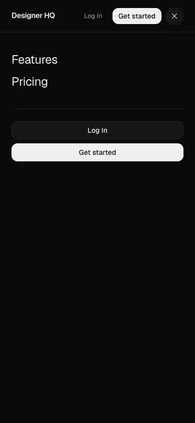
Why opaque, not blurred: the mocks under the nav are dense UI. A solid bar keeps the logo and CTA legible over them.
Buttons
| Variant |
Size |
Fill |
Text |
Radius |
Hover |
Transition |
| Primary |
36 px tall (32 in nav), padding 0 16 |
#eeeeee |
#111 14/20 500 |
12 px |
fill at 90 % |
colour, background, border 0.15 s cubic-bezier(.4,0,.2,1) |
| Secondary |
36 px |
#161616, 1 px transparent border |
#eee |
12 px |
#1c1c1c |
same |
| Pill tab (Claude / ChatGPT / Cursor) |
34 px |
#222 active |
#ededed 14 500 |
999 px |
|
colour, background, shadow 0.15 s |
| Switch chip (Monthly / Quarterly) |
28 px, padding 6 × 10 |
#202020 active |
12 px |
10 px |
|
scale .1s, color .2s cubic-bezier(.22,1,.36,1) |

Press feedback: --duration-press .1s on scale. Why: a light primary on dark is the highest-contrast object on the page, so there is never doubt where to click.
Bento tile (.wire-tile)
The background is the page colour, with 24 / 32 / 28 px padding. The mock sits at the top and fades out at its edges with linear-gradient(to right, transparent 45%, #0b0b0b 85%) plus a vertical gradient. The title is 24/30 510 and the caption 16/25 #a0a0a0.
App-mock primitives (inside tiles)
- Window chrome: traffic-light dots, title with a chevron, "Share" button (
cl-bar).
- Sidebar: 36 px icon rail with client logos and red count badges, a studio switcher ("Nonstop"), and nav items 13 px with icons (Home, Calendar, Tasks, Finance, Documents, Library, Artifacts, Boards, Canvas, Brand Hub, Process).
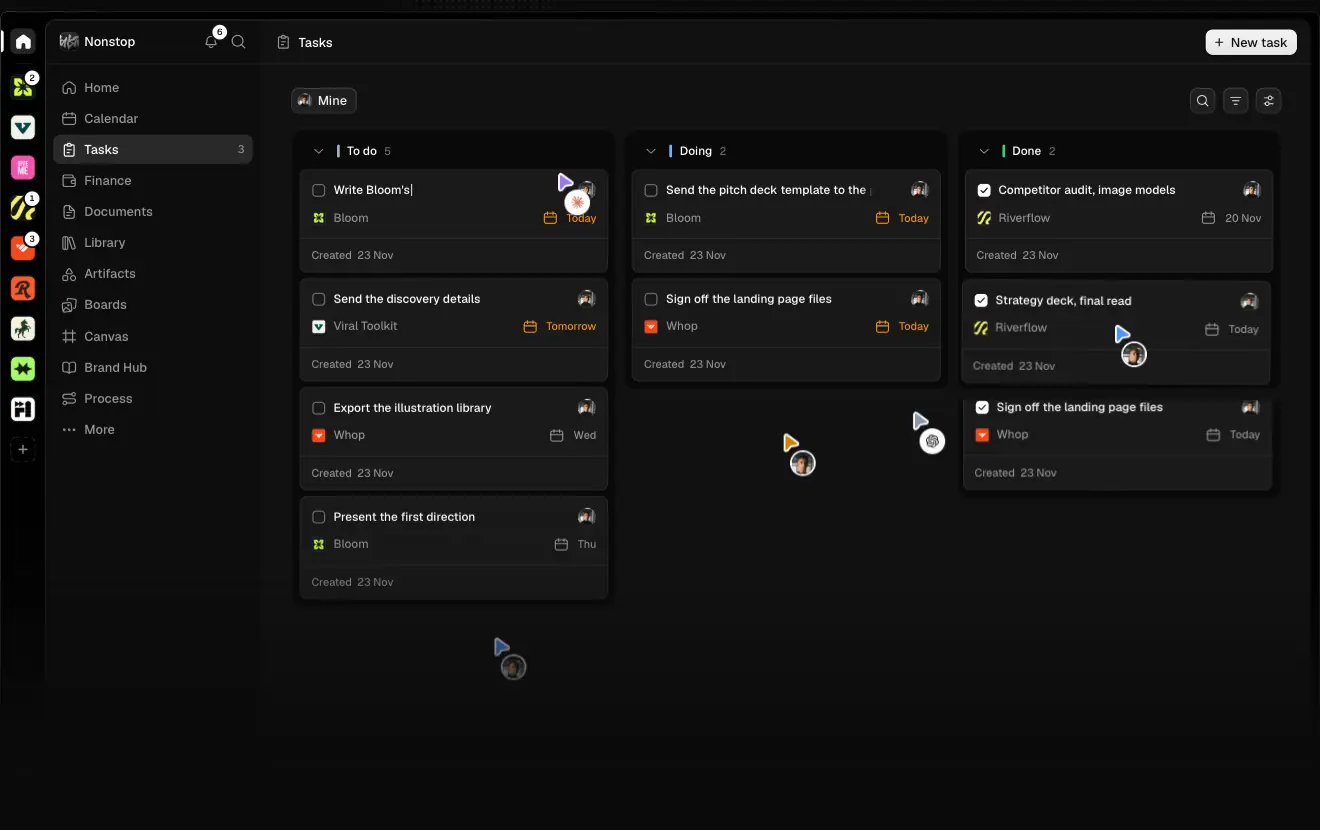
- Task card: 13/18 500 title, client chip with a coloured logo, due label (coral "Today", amber "Tomorrow"), "Created 23 Nov" footer, 8–12 px radius,
#121212–#181818 fill.
- Avatar: 20–28 px circle with a 2 px ring in the surface colour.
- Cursor: violet arrow plus a name-less avatar disc. The agent avatar is a coral 8-point asterisk on white.
- Chips and badges: 999 px pills, 12/16 500. Green "Shared"
#33cd70, "Waiting for Bloom" amber.
Toggles
Finance and Team tiles use iOS-like switches (on = white knob on light track). They are part of the mock.
Sticky scroll-spy list
Four 14 px links with ≈ 16 px between them. Active #ededed, inactive #a0a0a0, colour 0.15 s.

Claude / ChatGPT window
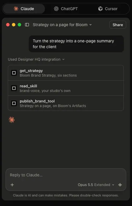
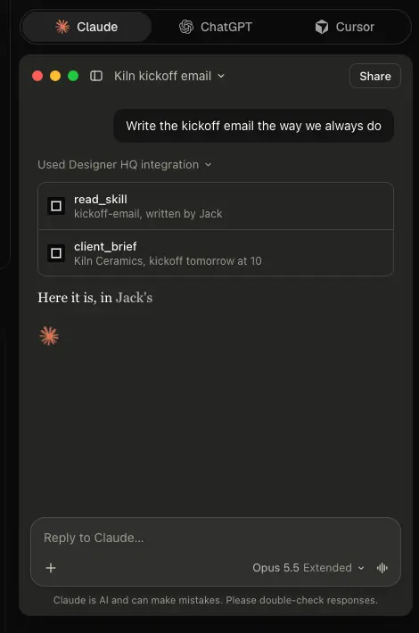
A 440 px wide window with a dark #262626 ≈ body, a user bubble at the right, "Used Designer HQ integration" tool rows (get_strategy, read_skill, publish_brand_tool) with square icons, an asterisk "thinking" mark, and a reply composer ("Reply to Claude…", "Opus 5.5 Extended"). The disclaimer reads "Claude is AI and can make mistakes. Please double-check responses."
Pricing plan header and table
Plan column: name 24/32 510, tagline 14 #a0a0a0, price 48 px 510 plus "a month" 13 px #6b6b6b, and a full-width 36 px button. The "Best choice for most studios" tab sits above Core: 12 px text, #161616 fill, top radius only (6px 6px 0 0). Table rows are 14/25 with #1f1f1f dividers. Checks are 14 px filled #eee circles with a dark tick, and missing items show "—" in #6b6b6b.
FAQ item
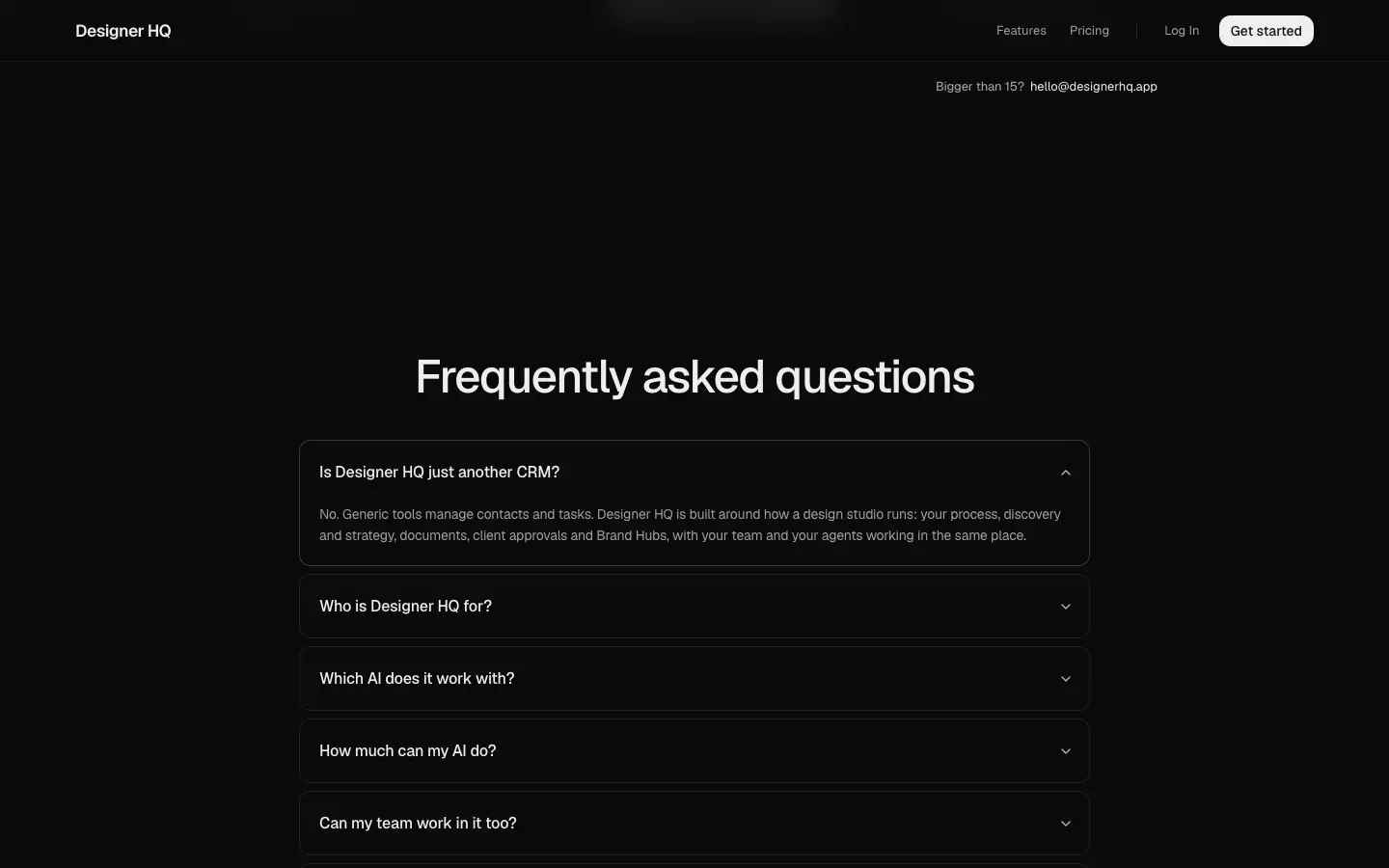
A 12 px-radius card with padding 0 × 20 and a 65 px question row. The question is 16 px 510, with a chevron at the right that flips. The open state gets a 1 px #3a3a3a border, and the answer is 14/22 #a0a0a0. Radix Collapsible animates the height (dhq-menu-down/up), and the answer fades from opacity 0, blur(--blur-small).
Footer
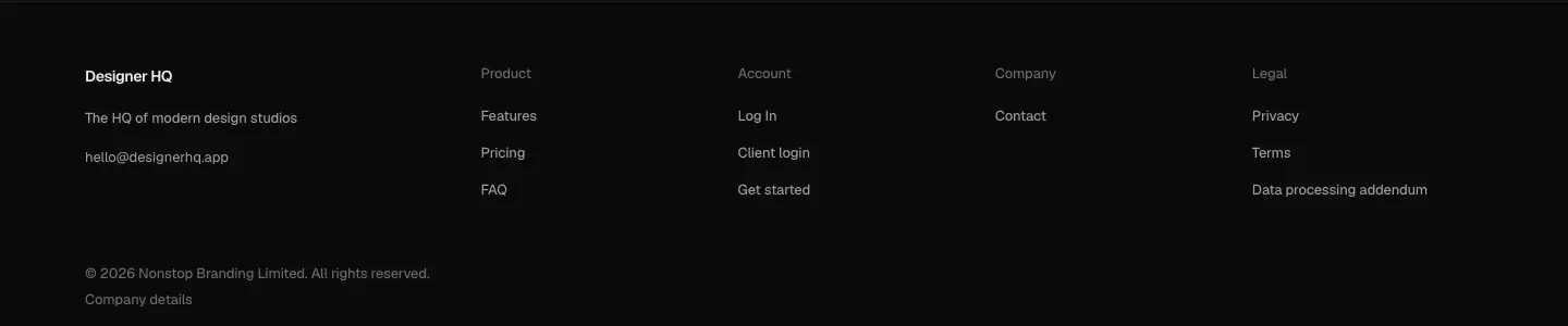
Columns: Product (Features, Pricing, FAQ) · Account (Log In, Client login, Get started) · Company (Contact) · Legal (Privacy, Terms, Data processing addendum). Each heading and link is 13 px. The left block holds the wordmark, "The HQ of modern design studios", and hello@designerhq.app (click to copy, which shows "Copied"). Legal line: "© 2026 Nonstop Branding Limited. All rights reserved. Company details", with a disclosure showing the registration.
Legal nav
The legal pages replace the marketing nav with a logo plus links to the other legal pages: Terms of Service, Privacy Policy, Data processing addendum, Security, and Open source notices (13 px #959595). The current page is omitted from its own nav.
09 · Art direction
The direction in one sentence
"Software as still life": the page is a dark, quiet frame, and all the imagery is the product's own UI filled with a believable studio's real-looking work.
1. Product UI as the only illustration
There are no stock photos, 3D renders of abstract shapes, or people photography in the page chrome. Each image is an HTML mock of a screen of the product.
- Scale: mocks are shown near 1:1 (13 px UI text inside a 1440 page), not shrunk into a laptop frame.
- Cropping: tiles crop the app hard at the right and bottom, and gradients fade it into the page (
transparent 45% → #0b0b0b 85%). The app seems to continue beyond the tile.
- Framing: the hero is the only full window (traffic lights, sidebar). Elsewhere, partial panels sit straight in the grid.
Why: designers judge tools by their craft. Real UI at real size is the strongest proof of quality, and cropping signals "there is more".
2. A fictional but specific world
The demo studio is Nonstop (the real agency behind the product). Its clients are Bloom (the main thread), Riverflow, Viral Toolkit, Whop, Kiln Ceramics, Fenwick. The people are Leo, Olivia Hart and Jack Watson. Dates sit in a real-feeling week ("23 Nov", "Thu 12"). Money is in pounds ("£70,840 Received").
Why: a consistent cast lets the reader follow one project (Bloom) from task board to proposal, contract, invoice and Brand Hub. That proves the product is connected, which is the headline claim.
3. Colour lives in the client work
The page chrome is grayscale. Colour enters only through the studio's deliverables:
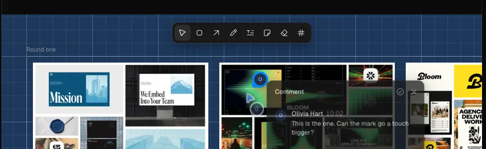
- Moodboards and the review canvas: editorial photography, posters ("VLOOM", "CREATE GOOD COMPANY"), a blue 1 px-grid canvas (
#1c375a, sampled) behind the work.
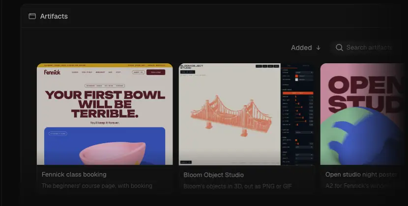
- Artifacts: a pink-and-yellow "YOUR FIRST BOWL WILL BE TERRIBLE." landing page, a coral isometric bridge (Bloom Object Studio), and an "OPEN STUDIO" poster in red, blue and green.
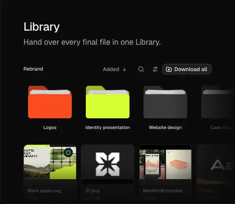
- Library: orange
#fa4c1f, lime #d8ff34 and graphite #3a3a3a folders (sampled).
- Brand Hub: "BLOOM BRAND HUB" in Bloom Display on navy
#070e18 (also the hub's text colour rgb(7,14,24) in the DOM).
Why: the work is the hero, the tool is the frame. It also makes the dark page feel alive without breaking the neutral system.
4. People as cursors and avatars
Real-photo avatars are 20–28 px circles with page-coloured rings. Cursors are violet arrows. The AI is a coral 8-point asterisk on a white disc, the same mark Claude uses in its chat (the "thinking" spinner in the Claude window).
Why: small, consistent stand-ins for "people" keep the page human without large lifestyle photos. Using Claude's asterisk ties "agent" to a tool the reader already uses.

5. Texture and light
- Dot field:
radial-gradient(rgba(255,255,255,.05) 1px, transparent 1.4px), a 5 % white dot grid around the hero frame.
- Nebula:
.hero-nebula, a fixed, masked glow layer behind the hero (transparent → #000 40% → transparent 66%). It is hidden once the hero ground has faded ([data-faded]).
- Lit border:
wire-lit with a conic gradient (from -70deg, transparent, #343434 70deg, transparent 140deg) and @keyframes dhq-lit rotating --dhq-lit to 360°. It draws a slow light sweep on tile edges.
- Glass:
.dhq-glass panels brighten on hover (filter: brightness(var(--dial-dk-hover,.93)) on dark).
- Footer wordmark: 256 px "Designer HQ" with a
#191919 → #121212 gradient clip, 1.1:1 against the page.
Why: texture stays at or below 5–8 % white, so it reads as atmosphere, not decoration. The lit border is the only "effect", and it moves slowly enough to go unnoticed until you look.
6. Iconography
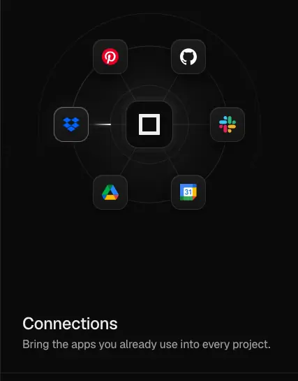
Line icons at 16 px, 1.5 px stroke (≈), rounded joins: home, calendar, clipboard, wallet, file, library, shapes, boards, grid, book, process. They look Lucide-style. Integration logos (Pinterest, GitHub, Dropbox, Slack, Google Drive, Google Calendar) appear in full colour inside 28 px round tiles in the Connections tile.
Why: a thin, neutral icon set keeps the mocks quiet so the coloured client logos and work stand out.
7. Logo and wordmark usage
- The brand mark is the plain text wordmark "Designer HQ" in Geist 600 (nav) and the 256 px gradient version in the footer. There is no separate symbol on the page.
- The favicon is a separate
icon.png / icon.ico under /designerhq/.
- The legal pages use the same text wordmark at 14 px 600 white.
- There is no public brand page:
/brand redirects to login. Brand Hubs are a product feature (/*/brand, /b/ links) for client brands.
Why: a text wordmark in the UI face says "tool, not lifestyle brand" and puts the studios' brands first.

Do and don't (inferred from the page)
| Do |
Don't |
| Show real UI at 1:1 with real-feeling data |
Use laptop mockups, stock people, abstract 3D blobs |
| Keep chrome grayscale, let client work carry colour |
Add a brand accent to headings or icons |
| Use one consistent cast (Nonstop, Bloom, Leo, Olivia) |
Use lorem ipsum or mixed demo brands |
| Fade mocks into the page with gradients |
Box mocks in shadows and borders |
| Keep texture ≤ 8 % white |
Use glows, gradients on text, neon |
10 · Brand assets and graphics inventory
Every distinct graphic on designerhq.app, with a crop, how it is made, and how to recreate it. Crops are PNG cuts from the 1440 captures. No SVG was downloaded.
| # |
Asset |
How it is built (measured) |
Recreate |
| 1 |
Text wordmark |
"Designer HQ", Geist 600 in the nav, 14 px 600 on legal pages |
Set the name in your UI face at 600. No symbol |
| 2 |
Footer giant wordmark |
256 px Geist 600, −0.04em, background: linear-gradient(#191919, #121212 70%), background-clip: text, bleeds off the bottom |
font-size: clamp(120px, 18vw, 256px), gradient clip, overflow: hidden on the footer |
| 3 |
Hero headline with rotating verb |
Spans per line, .hero-turn with data-turn JSON; letters split into .hero-turn-l; container width animates to the next word |
See Motion |
| 4 |
Collaboration cursors |
Violet arrow plus a white disc avatar; the agent disc holds a coral asterisk |
Absolute-positioned arrow (≈ 16 px) and a 24–28 px disc with a 2 px ring |
| 5 |
Agent asterisk |
Coral 8-point star, the same glyph Claude uses as its mark |
Do not copy another brand's mark; use your own AI glyph |
| 6 |
Hero app window |
HTML: icon rail, studio sidebar, Tasks board |
Build real components and fill them with a fictional cast |
| 7 |
Dot field |
radial-gradient(rgba(255,255,255,.05) 1px, transparent 1.4px) |
Same CSS with background-size: 12px 12px (≈) |
| 8 |
Hero nebula |
Fixed layer masked with linear-gradient(transparent, #000 40%, transparent 66%) |
A soft radial glow on a fixed layer with the same mask |
| 9 |
"Trusted by" ticker |
Avatars plus handles, duplicated track, translate(-50%) over 50 s, 6 % edge masks |
CSS keyframe marquee |
| 10 |
Hairline bento sheet |
Grid with a 1 px gap on rgba(255,255,255,.08), 12 px radius, overflow:hidden |
See Build recipe |
| 11 |
Tile fade-out |
linear-gradient(to right, transparent 45%, #0b0b0b 85%), linear-gradient(transparent 45%, #0b0b0b 100%) on the mock |
Same two gradients as an overlay |
| 12 |
Lit edge sweep |
Conic gradient from -70deg with #343434 at 70°, @property --dhq-lit animated to 360° |
@property angle plus a conic-gradient border mask |
| 13 |
Task cards |
8–12 px radius, client logo chip, coloured due date |
Component |
| 14 |
Calendar |
Week grid with coral and navy event blocks |
Component |
| 15 |
Connections orbit |
28 px brand logos around a centre square on a dotted ring |
Absolute-positioned logos on a circle |
| 16 |
Process steps |
Numbered step cards (Discovery, Strategy, Design) with dashed connectors (dhq-dash) |
stroke-dasharray with a stroke-dashoffset animation |
| 17 |
Finance chart |
£ totals and a green bar sparkline |
Component |
| 18 |
Timeline plus conversation |
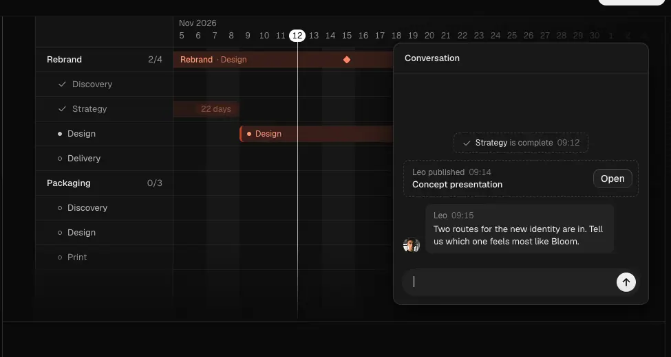
Gantt rows (Rebrand, Packaging) with a coral "Design" bar, plus a chat panel |
Component |
| 19 |
Review canvas |
Blue #1c375a grid with pinned work and a comment popover |
Repeating linear-gradient grid |
| 20 |
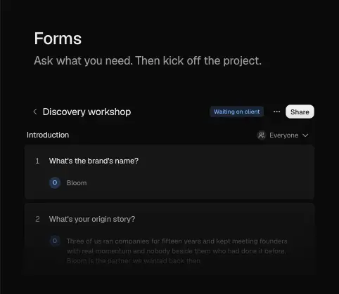
Forms / questionnaire |
Numbered questions with radio answers |
Component |
| 21 |
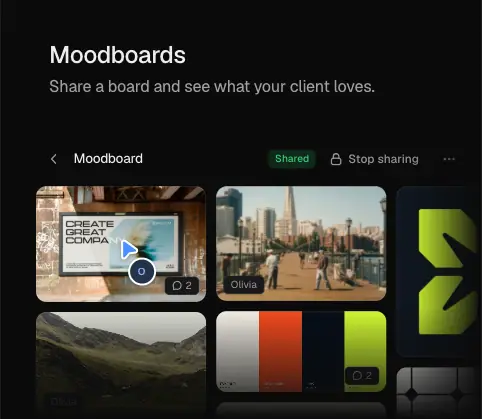
Moodboard grid |
Photo grid with play badges |
Images in a masonry grid |
| 22 |
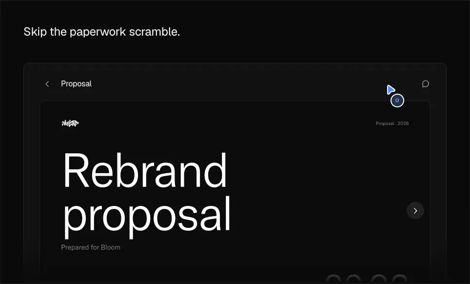
Proposal deck |
A big "Rebrand proposal" slide in a viewer with page dots |
Component |
| 23 |
Contract signatures |
Two signature boxes in Caveat ("Leo Benzoni", "Olivia Hart"), "Signed by both" |
A handwriting font in boxes |
| 24 |
Invoice |
White A4 invoice inside a dark viewer, "Pay by card £4,320" |
Component |
| 25 |
Brand Hub |
Bloom brand hub with chapter list and wide display type |
Component plus a display face |
| 26 |
Library folders |
Orange #fa4c1f, lime #d8ff34, graphite #3a3a3a folders plus file thumbnails |
CSS folder shape (tab plus body) |
| 27 |
Brand tool |
A poster generator with a coral bridge illustration and a control panel |
Component |
| 28 |
Claude window |
Tabs (Claude, ChatGPT, Cursor), tool-call rows, composer |
Component; generic AI chat styling |
| 29 |
Artifacts grid |
Three thumbnails of AI-built pages |
Screenshots of example work |
| 30 |
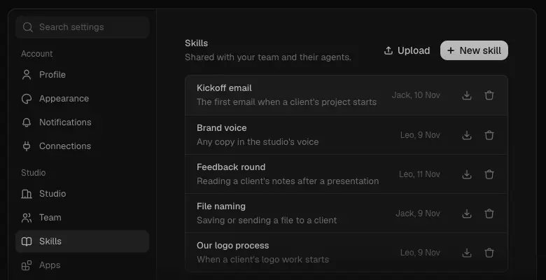
Skills settings |
Settings sidebar and a skills table with authors |
Component |
| 31 |
White-label browser |
Browser chrome with "hq.yourstudio.design" in the address bar |
Component |
| 32 |
Branded inbox and Helper |
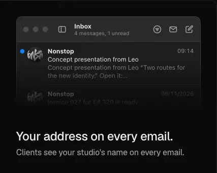
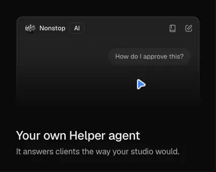
Mail list from "Nonstop", and a Helper chat "How do I approve this?" |
Component |
| 33 |
Pricing checks |
Filled #eee circles with a dark tick |
14 px circle plus a tick icon |
Crops
Identity


Hero
Bento tiles
Client room
AI
White label and pricing

Notes
- The mocks are scripted, so each crop shows one moment. The white-label browser tile was mostly empty when captured (its content types in).
- Client artwork inside the mocks (moodboard photos, posters) is demo content. Treat it as reference only.
- The scroll-spy list and Claude windows come from viewport shots, because they are sticky and are hidden in the stitched full page.
11 · Motion and interaction
Sources: computed transition / animation values on every visible element, @keyframes rules from the stylesheets, the --duration-* / --ease-* / --hero-* custom properties, timed polling in the page, and frame captures. Raw data is in data/home.probe.json, data/tokens-dark-computed.json and data/motion-log.json.
Motion tokens
| Token |
Value |
--duration-micro |
80 ms |
--duration-press |
100 ms |
--duration-colour, --duration-quick, default transition |
150 ms |
--duration-picture-answer |
200 ms |
--duration-fast |
250 ms |
--duration-panel, --duration-picture-step |
300 ms |
--duration-slow |
400 ms |
--duration-very-slow, --duration-picture-grow |
500 ms |
--duration-stagger |
60 ms |
--duration-letter |
45 ms |
--duration-travel (cursor moves) |
900 ms |
--duration-arrive-wait |
600 ms |
--duration-write (typing) |
1.4 s |
--ease-smooth-out, --ease-settle |
cubic-bezier(.22,1,.36,1) |
--ease-in-out |
cubic-bezier(.4,0,.2,1) |
--ease-out |
cubic-bezier(0,0,.2,1) |
--ease-bounce |
cubic-bezier(.34,1.36,.64,1) |
--ease-in-out-sine |
cubic-bezier(.37,0,.63,1) |
--ease-pointer |
cubic-bezier(.45,0,.2,1) |
Why tokens: the marketing mocks reuse the product's motion values, so the demo moves exactly like the app.
Hero entrance
All hero timings are multiplied by --hero-pace: calc(100/185) = 0.5405. That is why the computed durations read 0.675676 s and 0.540541 s.
| Element |
Keyframes |
Delay (token → effective) |
Duration (token → effective) |
Easing |
| Headline line 1 |
hero-in: opacity 0 → 1, blur(6px) → none, translateY(20%) → 0 |
0.55 s → 0.30 s |
1.25 s → 0.68 s |
cubic-bezier(.25,.1,.25,1) |
| Headline line 2 |
same |
+ 0.145 s step → 0.38 s |
same |
same |
| App frame |
hero-fade / hero-ground-in |
0.78 s → 0.42 s |
1 s → 0.54 s |
custom linear() spring-like curves |
| Lead |
hero-in, rise 9.6 px |
0.95 s → 0.51 s |
0.68 s |
same |
| Shine on frame |
hero-shine-climb, then hero-shine-settle (animates --shine-x/y) |
|
0.27 s each |
cubic-bezier(.455,.03,.515,.955) |
Phone: the word step is 0.33× (hero-tl-phone).
The frames are ≈ 0.65 s apart. Frame 1 shows the blurred headline, frame 2 the app arriving, and frames 5–12 the verb changing and cursors driving the demo into Calendar.
Rotating verb
- Words:
design → think → plan → create → work → design, from data-turn.
- Measured swap times after load (50 ms polling): 3263, 6259, 9263, 12230, 15277 ms. The interval is ≈ 3.0 s. During a swap both words exist for ≈ 0.4 s.
- Method (from the inline script): the container width animates from the old word width to the new one. Letters are split into spans, and the new word enters per letter. The cursors (
hero-turn-who) drift with small offsets (C = [[-2.2,1.6],[2,-1.4],…]) so they look hand-held. Easing constants in the script: cubic-bezier(0.16,1,0.3,1), cubic-bezier(0.37,0,0.63,1), cubic-bezier(0.22,1,0.36,1), cubic-bezier(0.45,0,0.2,1).
- Reduced motion:
matchMedia("(prefers-reduced-motion: reduce)") → the word is replaced instantly, and CSS sets .hero-in, .hero-track, .hero-ground, .hero-product, .hero-shine … { animation: none }.
Why: a 3 s beat is long enough to read the line twice. The width animation keeps "together." from jumping.
Scroll reveal
19 elements carry transition: opacity, translate, filter 0.676 s cubic-bezier(.25,.1,.25,1) (the hero curve × pace). They fade, rise and un-blur when they enter view. Panels inside the client section use intake-step-in (opacity 0, translate var(--enter-x,16px) 0) and disc-enter (opacity 0, translateY 12px). Exact trigger thresholds come from inline scripts and were not measured.
Smooth scrolling: html.lenis (Lenis library). Wheel scrolling is eased by JavaScript.
Scripted product demos
Each mock runs a timeline of cursor moves (--duration-travel 900ms, --ease-pointer), typing (--duration-write 1.4s, --duration-letter 45ms), arrivals (dhq-arrive: opacity 0, translateY(6px) → none) and "thinking" dots (dhq-think: opacity .3 ↔ 1, translateY 0 ↔ −2 px). Other keyframes: dhq-fill (scaleX 0 → 1, progress bars), dhq-dash (stroke-dashoffset −10px, connectors), dhq-breathe (opacity 1 ↔ .5), dhq-blink (caret), dhq-pane-in (translate 0 100% → 0), dhq-tilt (rotate from --tilt × 2deg to 0), and ds-shimmer (skeleton shimmer).
Why: the demos replace a product video. They are lighter, sharp at every size, and the reader can stop on any frame.
Ticker
dhq-ticker 50s linear infinite, transform: translate(-50%) on a duplicated track. It is turned off under reduced motion.
Hover and press
| Element |
Rest → hover |
Transition |
| Primary button |
#eeeeee → #eee at 90 % alpha |
background 0.15 s cubic-bezier(.4,0,.2,1) |
| Secondary button |
#161616 → #1c1c1c |
same |
| Nav / footer link |
#a0a0a0 → #ededed |
colour 0.15 s |
| Glass panels |
filter: brightness(.93) on dark (1.25 in light) |
|
| Switch chip |
scale press 0.1 s, colour 0.2 s |
cubic-bezier(.22,1,.36,1) |
| Mock transforms |
transform, translate, scale, rotate 0.25 s cubic-bezier(.22,1,.36,1) (13 elements) |
|
None of the buttons move or scale on hover. Only fill and colour change. Why: UI-like restraint. The page behaves like the app, not like an ad.
Disclosure
- FAQ: Radix Collapsible. Height via
dhq-menu-down/up (to --radix-collapsible-content-height). The answer goes from opacity 0 + blur(--blur-small) to visible in 0.25 s --ease-smooth-out. On close, opacity drops in 0.15 s and the blur snaps after it. The chevron rotates.
- Mobile menu: a full-height panel under the bar. No animation was measured on open (
animation: none); the first frame 120 ms after the tap already showed the open panel.
Not measured
- Trigger thresholds and stagger for scroll reveals (set by inline scripts).
- Exact timing of each mock's scripted timeline, beyond the tokens above.
- The lit-edge sweep speed (
dhq-lit): the keyframe exists, but no running animation was caught in the probe.
12 · Glossary
Terms you need to describe or brief a page like designerhq.app.
| Term |
Meaning here |
| Product-led hero |
A hero whose main image is the product UI, inside the first viewport |
| HTML mock (live mock, faux UI) |
Product screens rebuilt in HTML/CSS instead of screenshots, so they stay sharp and can animate |
| Scripted demo |
A timeline that moves fake cursors, types text and changes views inside an HTML mock |
| Multiplayer cursor |
A labelled pointer showing another person or agent in the same document |
| Rotating word (word swap, text rotator) |
One word in a headline that cycles through options (design → think → plan → create → work) |
| Blur-in |
An entrance where text goes from filter: blur(6px) and opacity 0 to sharp |
| Pace multiplier |
One custom property (--hero-pace) that scales every hero delay and duration |
| Bento grid |
A grid of unequal tiles (wide 2×2, tall 1×2, long 2×1, cell 1×1) |
| Hairline grid (gap-border) |
Tiles on a light background with a 1 px gap, so the gaps draw the lines |
| Edge fade |
A gradient from transparent to the page colour that dissolves a cropped mock into the background |
| Section intro (split intro) |
H2 at the left and a lead paragraph in the right column |
| Scroll-spy |
A sticky list that highlights the item matching the content in view |
| Sticky aside |
A side panel with position: sticky that stays while the text blocks scroll past |
| Logo ticker (marquee) |
A row of logos or handles that scrolls sideways forever |
| Edge mask |
mask-image with a gradient that fades the ticker at both ends |
| Comparison table |
A table of plan features with checks, here merged with the plan cards |
| Sticky table header |
The plan names and buttons stay at the top while the feature rows scroll |
| Plan switch (billing toggle) |
The Monthly / Quarterly segmented control |
| Recommended tab |
The "Best choice for most studios" tab attached to the top of one plan column |
| Accordion (disclosure, collapsible) |
FAQ items that open in place |
| Giant footer wordmark |
An oversized brand name at the bottom of the footer, usually cropped and low-contrast |
| Gradient text clip |
background-clip: text with a gradient fill |
| Dot field |
A background of tiny dots from a radial-gradient |
| Nebula / glow layer |
A soft, masked light layer behind the hero |
| Lit border (light sweep) |
A conic gradient on a border that rotates with an animated @property angle |
| Design tokens |
Named values (--ds-gray-900, --duration-fast) used by every component |
| Gray ramp |
Numbered neutral steps (gray-100 … gray-1000) used for surfaces and text |
| Heading weight 510 |
A variable-font weight between Medium (500) and Semibold (600) |
| Optical tracking |
Negative letter-spacing on large headings (−0.03em) to keep words tight |
| text-balance / text-pretty |
CSS text-wrap values that even out heading lines and avoid orphans |
| Reduced motion |
prefers-reduced-motion: reduce. Here it turns the hero and ticker animations off |
| Smooth scroll (Lenis) |
A JavaScript library that eases wheel scrolling |
| Astro island |
An interactive component inside an otherwise static Astro page (Pricing, FAQ) |
| White label |
The product runs under the customer's own domain, email and name |
| MCP |
Model Context Protocol. It lets Claude, ChatGPT or Cursor use Designer HQ's tools |
| Brand Hub |
The product's client-facing brand guideline site, shared by link |
Paste-ready brief
Dark, product-led one-page site for a B2B tool. Page #0b0b0b, text #ededed / #a0a0a0, no accent colour. Geist Variable only: headings 510 with −0.03em tracking (H1 64/64, H2 48/52, tile titles 24/30), copy 450 (16/25, leads 24/32 in #cecece). 1284 px container, 264 px section top padding. Hero: centred H1 with one rotating verb every 3 s and two multiplayer cursors parked on it, an 18 px lead, primary light button and secondary dark button (36 px, radius 12), then a full-width HTML mock of the app with a scripted cursor demo. Sections: handle ticker, split intro plus hairline bento (1 px gaps on 8 % white, 12 px outer radius), sticky scroll-spy with large feature panels, text blocks with a sticky AI chat window, asymmetric 3-tile white-label grid, pricing merged into a comparison table with a sticky plan header, FAQ cards, centred closing CTA, footer with a 256 px gradient-clipped wordmark. Motion: blur-in headline (6 px, rise 20 %), 150 ms colour hovers, cubic-bezier(.22,1,.36,1), no hover lifts, reduced motion respected.
13 · Build recipe
A starter that reproduces the system. Values are the measured ones. Geist is free (OFL): npm i geist or download it from vercel.com/font.
Tokens
@font-face { font-family: Geist; src: url(/fonts/Geist-Variable.woff2) format("woff2"); font-weight: 100 900; font-display: swap; }

:root {
  color-scheme: dark;
  /* surfaces */
  --bg: #0b0b0b; --card: #060606; --muted: #0f0f0f; --secondary: #161616;
  --accent: #1e1e1e; --accent-active: #232323;
  /* lines */
  --border: #1f1f1f; --divider: #1c1c1c; --stroke-strong: #3a3a3a; --hairline: rgba(255,255,255,.08);
  /* text */
  --fg: #ededed; --fg-lead: #cecece; --fg-muted: #a0a0a0; --fg-meta: #8f8f8f; --fg-faint: #6b6b6b;
  --primary: #eeeeee; --primary-fg: #111111;
  /* status (use inside product mocks only) */
  --coral: #fc997f; --green: #33cd70;
  /* type */
  --font: Geist, system-ui, sans-serif;
  --w-heading: 510; --w-copy: 450; --w-ui: 500;
  /* radius */
  --r-sm: 6px; --r-md: 8px; --r-lg: 12px; --r-pill: 999px;
  /* motion */
  --d-micro: 80ms; --d-quick: 150ms; --d-fast: 250ms; --d-panel: 300ms; --d-slow: 400ms;
  --ease-out: cubic-bezier(.22,1,.36,1); --ease-in-out: cubic-bezier(.4,0,.2,1);
  --hero-pace: calc(100 / 185);
  /* layout */
  --wrap: 1284px; --nav-h: 64px; --section-pt: 264px;
}

html { background: var(--bg); color: var(--fg); font-family: var(--font); -webkit-font-smoothing: antialiased; }
body { padding-top: var(--nav-h); font-weight: var(--w-copy); }
Type scale
.h-64 { font-size: 64px; line-height: 64px; letter-spacing: -.03em; font-weight: var(--w-heading); text-wrap: balance; }
.h-48 { font-size: 48px; line-height: 52px; letter-spacing: -.032em; font-weight: var(--w-heading); }
.h-24 { font-size: 24px; line-height: 30px; letter-spacing: -.018em; font-weight: var(--w-heading); }
.lead-24 { font-size: 24px; line-height: 32px; color: var(--fg-lead); }
.lead-18 { font-size: 18px; line-height: 27px; color: var(--fg-muted); text-wrap: pretty; }
.copy-16 { font-size: 16px; line-height: 25px; letter-spacing: -.011em; color: var(--fg-muted); }
.label-14 { font-size: 14px; line-height: 20px; }
.small-13 { font-size: 13px; line-height: 20px; letter-spacing: -.01em; color: var(--fg-muted); }
@media (max-width: 640px) { .h-64 { font-size: 36px; line-height: 40px; } .h-48 { font-size: 22px; line-height: 28px; letter-spacing: -.012em; } }
Layout
.wrap { max-width: var(--wrap); margin-inline: auto; padding-inline: 78px; box-sizing: content-box; }
@media (max-width: 1440px) { .wrap { max-width: none; } }
@media (max-width: 640px)  { .wrap { padding-inline: 23px; } }
.section { padding-top: var(--section-pt); }
@media (max-width: 640px) { .section { padding-top: 128px; } }

.intro { display: grid; grid-template-columns: 542px 566px; justify-content: space-between; gap: 132px; align-items: start; margin-bottom: 64px; }
@media (max-width: 1024px) { .intro { grid-template-columns: 1fr; gap: 16px; } }
Nav
.nav { position: fixed; inset: 0 0 auto; height: var(--nav-h); z-index: 40; background: var(--bg); }
.nav::after { content: ""; position: absolute; inset: auto 0 0; height: 1px; background: rgb(255 255 255 / .05); }
.nav a { font-size: 14px; color: var(--fg-muted); transition: color var(--d-quick) var(--ease-in-out); }
.nav a:hover { color: var(--fg); }
Buttons
.btn { display: inline-flex; align-items: center; height: 36px; padding: 0 16px; border-radius: var(--r-lg);
       font: var(--w-ui) 14px/20px var(--font); border: 1px solid transparent;
       transition: background-color var(--d-quick) var(--ease-in-out), border-color var(--d-quick) var(--ease-in-out); }
.btn-primary { background: var(--primary); color: var(--primary-fg); }
.btn-primary:hover { background: rgb(238 238 238 / .9); }
.btn-secondary { background: var(--secondary); color: var(--fg); }
.btn-secondary:hover { background: #1c1c1c; }
.btn:active { scale: .98; transition-duration: 100ms; }
Hairline bento
.bento { display: grid; grid-template-columns: repeat(3, 1fr); grid-auto-rows: 272px; gap: 1px;
         background: var(--hairline); border-radius: var(--r-lg); overflow: hidden; }
.tile { background: var(--bg); padding: 24px 32px 28px; display: flex; flex-direction: column; justify-content: flex-end; position: relative; overflow: hidden; }
.tile[data-size=wide] { grid-area: span 2 / span 2; }
.tile[data-size=tall] { grid-row: span 2; }
.tile[data-size=long] { grid-column: span 2; }
.tile .mock::after { content: ""; position: absolute; inset: 0;
  background: linear-gradient(to right, transparent 45%, var(--bg) 85%), linear-gradient(transparent 45%, var(--bg) 100%); }
.tile h3 { font-size: 24px; line-height: 30px; letter-spacing: -.018em; font-weight: var(--w-heading); }
.tile p { font-size: 16px; line-height: 25px; color: var(--fg-muted); }
@media (max-width: 640px) { .bento { grid-template-columns: 1fr; } .tile[data-size] { grid-area: auto; } }
Hero entrance and rotating word
@keyframes hero-in { from { opacity: 0; filter: blur(6px); transform: translateY(var(--rise, 20%)); } }
.hero-line { animation: hero-in calc(1.25s * var(--hero-pace)) cubic-bezier(.25,.1,.25,1)
             calc((.55s + var(--n, 0) * .145s) * var(--hero-pace)) both; }
.hero-sub { --rise: 9.6px; animation-delay: calc(.95s * var(--hero-pace)); }
@media (prefers-reduced-motion: reduce) { .hero-line, .hero-sub, .ticker-track { animation: none; } }
// Rotate one word every 3 s; animate the container width so the line does not jump.
const el = document.querySelector('[data-turn]');
const words = JSON.parse(el.dataset.turn); let i = 0;
const reduce = matchMedia('(prefers-reduced-motion: reduce)').matches;
setInterval(() => {
  i = (i + 1) % words.length;
  const from = el.offsetWidth; el.textContent = words[i]; const to = el.offsetWidth;
  if (!reduce) el.animate([{ width: from + 'px' }, { width: to + 'px' }], { duration: 400, easing: 'cubic-bezier(.22,1,.36,1)' });
}, 3000);
Ticker
.ticker { overflow: hidden; mask-image: linear-gradient(90deg, transparent, #000 6%, #000 94%, transparent); }
.ticker-track { display: flex; gap: 32px; width: max-content; animation: ticker 50s linear infinite; }
@keyframes ticker { to { transform: translate(-50%); } }
FAQ card
.faq { display: grid; gap: 8px; max-width: 820px; margin-inline: auto; }
.faq details { background: var(--bg); border: 1px solid var(--border); border-radius: var(--r-lg); padding: 0 20px; }
.faq details[open] { border-color: var(--stroke-strong); }
.faq summary { padding: 20px 0; font-size: 16px; font-weight: var(--w-heading); cursor: pointer; list-style: none; }
.faq p { font-size: 14px; line-height: 22px; color: var(--fg-muted); padding-bottom: 20px; }
Footer wordmark
.footer { border-top: 1px solid var(--border); padding-top: 56px; overflow: hidden; }
.footer-mark { font-size: clamp(96px, 17.8vw, 256px); line-height: 1; font-weight: 600; letter-spacing: -.04em;
  background: linear-gradient(#191919, #121212 70%); -webkit-background-clip: text; background-clip: text; color: transparent;
  margin-bottom: -.18em; white-space: nowrap; }
Checklist
- Build the product mocks first. They are the art.
- Write a fictional cast (studio, clients, people) and use it in every mock.
- Keep chrome grayscale. Let mock content carry colour.
- Use one easing (
.22,1,.36,1) and the duration tokens everywhere.
- Respect
prefers-reduced-motion for the hero, the ticker and the demos.
- Keep 13 px meta text at
#8f8f8f or lighter: #6b6b6b fails AA (3.7:1).
Home · /
https://designerhq.app/ · 15,339 px tall at 1440 · 14,228 px at 390 · 15,448 px at 768 · <title> "Designer HQ: the new standard for modern design studios"
Built with Astro (static HTML plus astro-island components for Pricing and FAQ), Tailwind v4 classes, and Lenis smooth scroll. Nine sections and a footer.
1. Nav (0–64)
A fixed, opaque 64 px bar with a 5 % white hairline. "Designer HQ" at x 78; Features, Pricing | Log In, "Get started" at the right edge (x 1362). Why: two content links only, because the page is one scroll. Log In stays visible for existing users, who are a large share of visits to a tool's home page.
2. Hero (64–1400)
- H1 64/64 510, −1.92 px, two lines, with the rotating verb (design / think / plan / create / work, every ≈ 3 s) and two cursors parked on it.
- 18/27 lead in #a0a0a0.
- "Pick your plan" (primary) and "See how it works" (secondary), 36 px.
- A full app window from y ≈ 510: client-logo rail with unread badges, the "Nonstop" studio sidebar, and a Tasks board (To do 5 / Doing 2 / Done 2). The scripted cursors move cards and open Calendar.
- 5 % dot field and a masked nebula behind it.
Why: the reader sees the promise (H1), the scope (lead), and the product working (frame) in the first 900 px. See Heroes.
3. Trusted by (≈1320–1400)
 7 studio Instagram handles with 24 px avatars (byfrankieharry, jackwatsondesigns, rosegardencreative, joe.hitch, nonstopbranding, carlyincolour, samsoedesign), 14/20 500
#a0a0a0, in a 50 s marquee with 6 % edge masks. Why: handles match the 1–5 person studio buyer better than company logos would.
4. Features, "Your whole studio, connected" (1400–3196)
- Split intro: H2 48/52 (542 px), and a 24/32 #cecece lead at x 752: "Plan every project, track every task and connect anything your studio runs on."
- Hairline bento 1284 × 1364 at y 1844: Tasks (wide 856 × 545), Calendar (tall), Connections (tall; 6 integration logos orbit a centre square), Process (wide; Discovery → Strategy → Design step cards with dashed links), Finance (long; £70,840 received, £7,680 open, £26,725.62 spent, bar sparkline), Team (cell; Jack Watson's access switches).
Why: six tiles map the studio's six back-office jobs. The wide tiles alternate sides, which guides the eye in a Z.
5. Clients, "One room for every way you work with clients" (3196–7251)
 - A sticky scroll-spy at the left (
top: 128px): Keep clients up to date · Gather feedback and run sessions · Proposals, contracts and invoices · Deliver a premium experience.
- Four 964 px panels at the right, each with a one-line headline in 16 px:
1. "Share every step and message in one place, so your client is never left guessing." Timeline (Rebrand 2/4, Packaging 0/3) plus a client conversation.  2. "Stop chasing feedback over email. Your client comments right on the work." Blue review canvas with a comment pinned on a poster, then Forms (discovery questionnaire) and Moodboards (shared board).

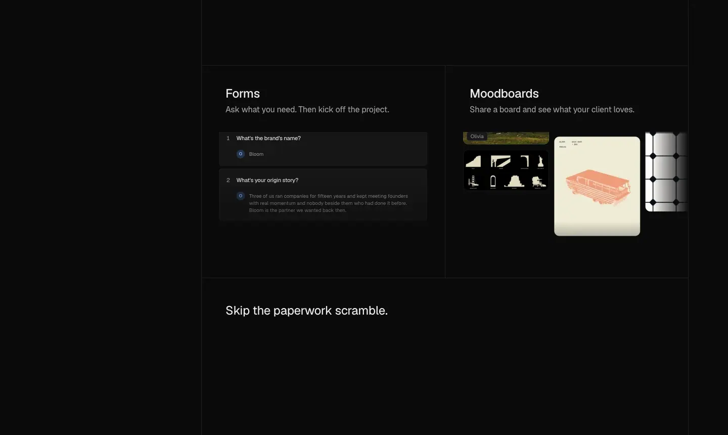 3. "Skip the paperwork scramble." A "Rebrand proposal" deck, then Contracts (two Caveat signatures, "Signed by both") and Invoices (invoice 027, "Pay by card £4,320").
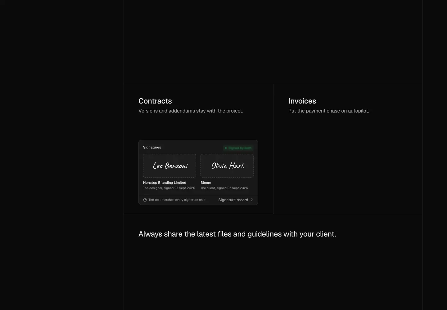 4. "Always share the latest files and guidelines with your client." Bloom Brand Hub, then Library (coloured folders) and Brand tools (bridge poster generator).
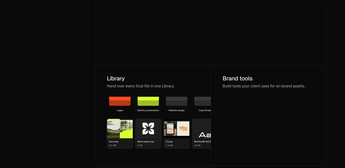
Why: this is the longest section because the client room is the product's difference from a generic project tool. The sticky list keeps a 4-chapter structure visible through 4,000 px of scroll.
6. AI, "Connect your agents to your studio" (7251–9633)

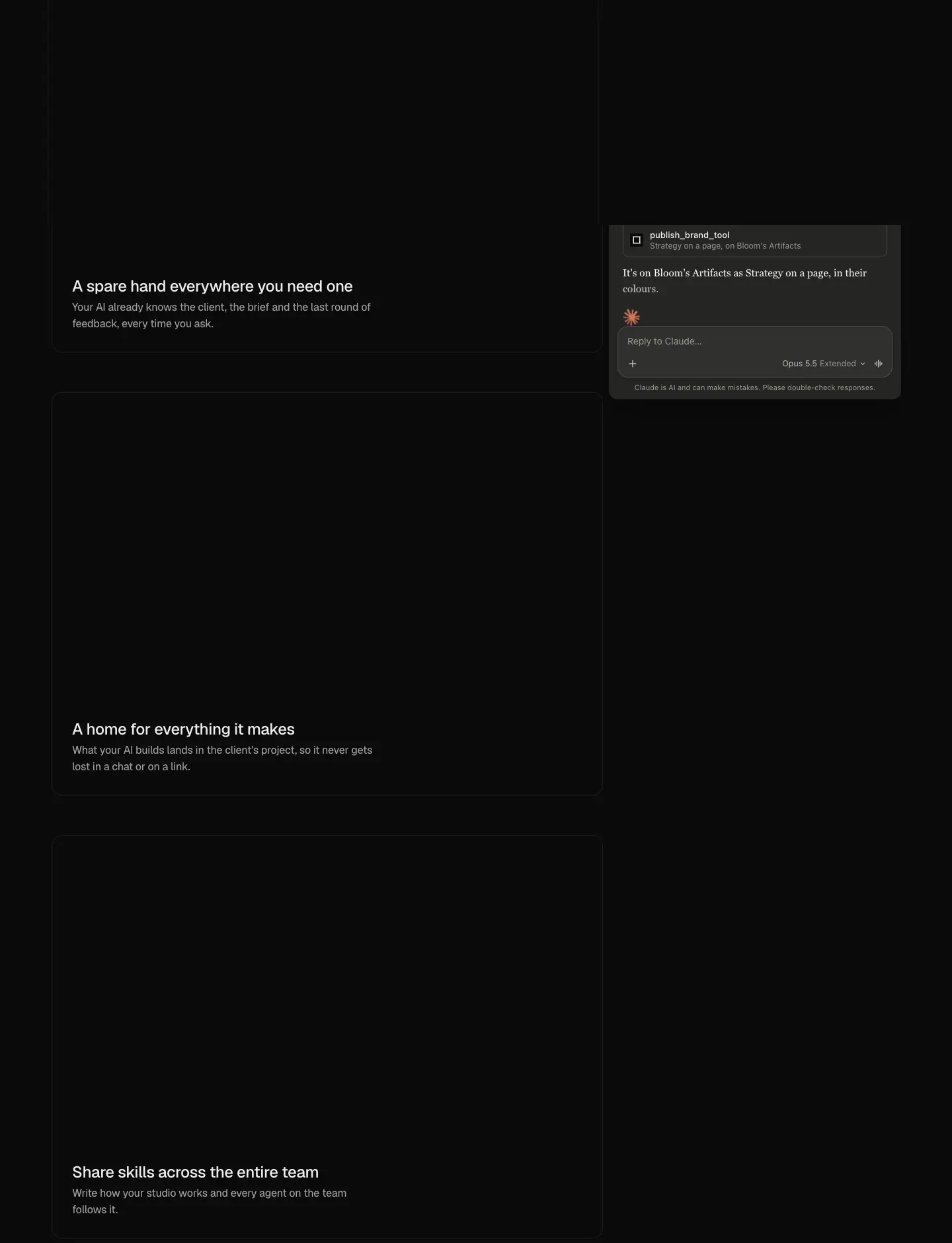 - Lead: "Connect Claude, ChatGPT or Cursor and it works right inside your studio."
- Three left blocks (520 px text column): "A spare hand everywhere you need one" (review canvas with an
@bot mention), "A home for everything it makes" (Artifacts grid: Fenwick landing page, Bloom Object Studio bridge, "Open studio" poster), "Share skills across the entire team" (Skills settings: Kickoff email, Brand voice, Feedback round, File naming, Our logo process).
- Right: a sticky 440 × 680 window with Claude / ChatGPT / Cursor pill tabs. The conversation follows the active block: "Turn the strategy into a one-page summary for the client" → tool calls get_strategy, read_skill, publish_brand_tool; "Write the kickoff email the way we always do" → read_skill, client_brief → "Here it is, in Jack's…".
Why: it shows MCP as a two-sided story. You ask in the AI tool you already pay for, and the result lands inside the client project.
7. White label, "A white label OS under your studio name" (9633–10746)
- Lead: "Run your HQ on your domain, send from your address and give the Helper your studio's knowledge."
- Asymmetric bento: Your domain, your HQ. (856 × 681, browser at hq.yourstudio.design), Your address on every email. (inbox of Nonstop-branded mails: "Invoice 027 for £4,320 is ready"), Your own Helper agent (chat: "How do I approve this?").
Why: the Studio plan ($149) is sold on white label, so this section sits directly before Pricing.
8. Pricing (≈10746–12800)
- "Pricing" H2 at x 240, Monthly / Quarterly switch.
- Core $49/month, "Your studio, with your AI.", with a "Best choice for most studios" tab. Studio $149/month, "Your studio's own HQ.". The FAQ states the quarterly prices: $129 and $379 per 3 months.
- Table groups: Your studio (Team members up to 3 / up to 15, unlimited clients and projects, 250 GB / 1 TB storage, 1M / 3M AI tokens each month), White label (yourstudio.designerhq.app vs your own domain, emails from Designer HQ vs your own address, Helper agent and "Your clients never see Designer HQ" on Studio only), The work (11 shared features: private client room, discovery workshops, AI strategy drafts, proposals/contracts/invoices, client approvals, Brand Hubs, tasks/timelines/calendars, payments and expenses tracker, Claude/ChatGPT/Cursor, Google Calendar/Drive/Dropbox).
- Footnote: "Bigger than 15? hello@designerhq.app".
- The sticky plan header (top: 63px) follows the table.
Why: only two plans, and the differences fit in 6 rows (team size, storage, tokens, 3 white-label rows). The table makes that visible, and "Best choice" steers to the cheaper plan, which lowers the barrier for small studios.
9. FAQ (≈12800–13925)
"Frequently asked questions" centred, then 13 rendered questions in 820 px cards. See Copywriting for answers. The markup also holds Free-plan variants of some answers, which were not displayed.
10. Closing CTA (13925–14657)
"Give your studio a connected HQ today", 64/64 centred, with "Pick your plan". 264 px above and below.
11. Footer (14801–15339)
See Header, footer and mobile menu.
Responsive

At 390: one column, H1 36/40, H2 22/28, section padding 128 px, bento stacked at 344 px, the scroll-spy list is hidden (display: none), the Claude window becomes an inline 344 × 640 block, the desktop pricing header is hidden and the plan switch moves (dhq-switcher lg:hidden variant), and the nav collapses to Log In + Get started + Menu. At 768: H1 54.5 px, H2 40/44, 3-column bento at 232 px.

Legal page template · /terms, /privacy, /dpa
Three samples of one template. They are built with Next.js (/_next/static/…, next/font Geist), not the Astro stack of the home page.
| Page |
Title |
Height at 1440 |
Sections |
| /terms |
"Terms of Service · Designer HQ" |
3,879 px |
13 numbered H2 |
| /privacy |
"Privacy Policy · Designer HQ" |
6,848 px |
11 numbered H2, plus a list of processors |
| /dpa |
"Data processing addendum · Designer HQ" |
3,211 px |
15 numbered H2 |
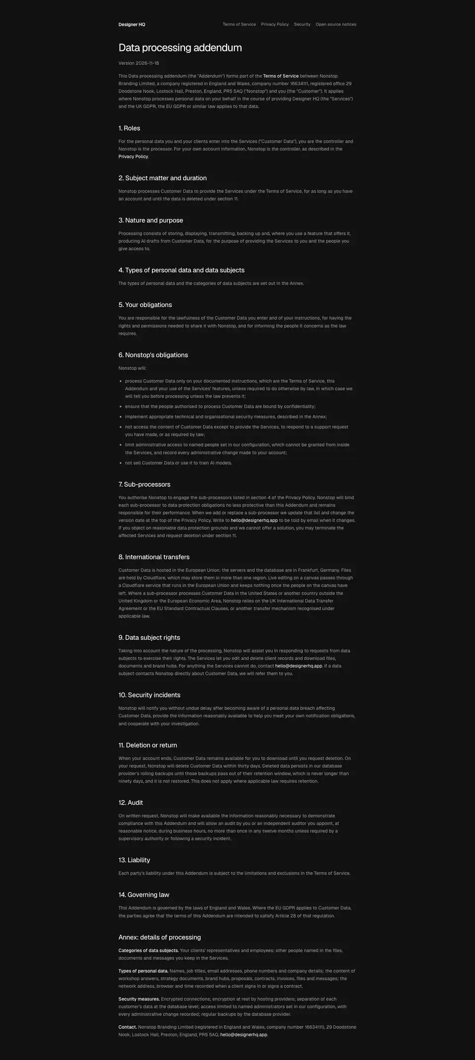
Structure
- Bar: at 390 the links wrap onto two lines under the logo. At 1440: "Designer HQ" (14 px 600 white) at the column's left edge. At the right, links to the other legal pages (13/16 450
#959595): Terms of Service · Privacy Policy · Data processing addendum · Security · Open source notices. The current page is left out.
- H1: 32/40 450, −1.28 px,
#fff.
- Version line: "Version 2026-11-18", 14 px
#959595.
- Body: numbered H2s (20/26 450, −0.4 px,
#fff) and paragraphs 14/23.1 450 #959595. Definitions get a bold 500 white lead-in ("Information you provide."). The email hello@designerhq.app and cross-links are white.
- Privacy processors: a 14/20 list of the service providers it names: Vercel, Neon, Cloudflare, Whop, Anthropic, Resend, Sentry and Google. All in
#959595.
Measured
| Property |
Value |
| Background |
#121212 (lighter than the home #0b0b0b) |
| Column |
721 px at x 359 |
| Body contrast |
#959595 on #121212 = 6.25 : 1 |
| Heading contrast |
#fff on #121212 = 18.7 : 1 |
| Measure |
≈ 95 characters per line at 14 px |
| Line-height |
1.65 |
Why
- Lighter black and smaller type than the marketing page: long-form reading on
#0b0b0b with #a0a0a0 text causes glare. #121212 and #959595 lower the contrast step (6.25 : 1, still AA) for comfort.
- Weight 450 for headings (not 510) keeps the page quiet. Legal text should not look like marketing.
- A version date at the top instead of "Last updated" in the footer: it is the first thing a lawyer looks for.
- Plain English: "We are not a law firm, an accountant or a financial adviser". The tone matches the product voice.
- Company identity in the Terms: "Nonstop Branding Limited… company number 16634111, registered office 29 Doodstone Nook, Lostock Hall, Preston". A small vendor builds trust by naming the legal entity.
Phone
The column fills 344 px with 23 px gutters, and the type sizes stay the same. The legal nav wraps under the logo.
Security · /security
https://designerhq.app/security · "Security · Designer HQ" · 1,897 px at 1440, 2,679 px at 390.
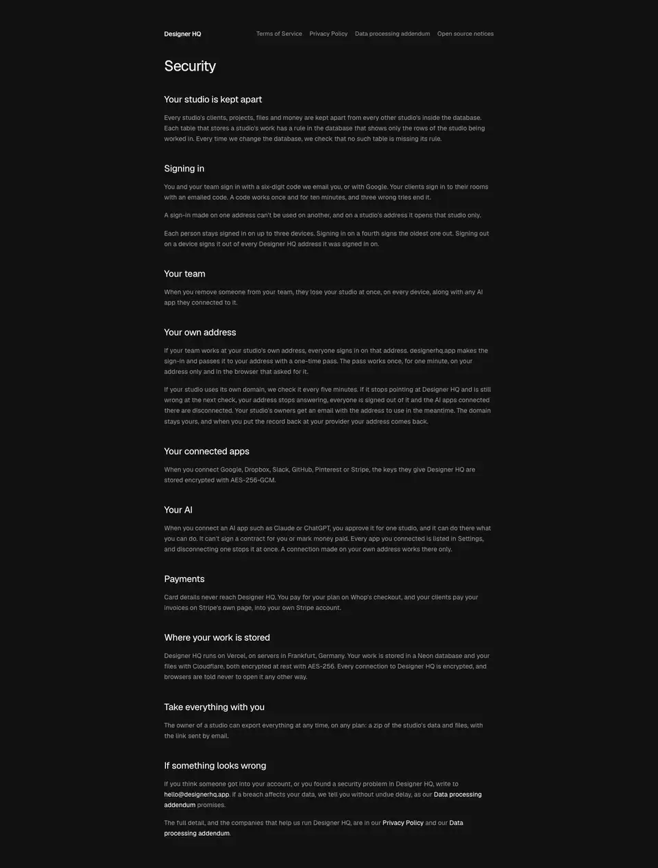
Same Next.js template as the legal pages, without numbering and without a version line.
Sections (H2 20/26, white)
- Your studio is kept apart. Row-level rules on every table: "Every time we change the database, we check that no such table is missing its rule."
- Signing in. A six-digit email code or Google. Codes work once, for ten minutes, and three wrong tries end them. Up to three devices per person.
- Your team. Removing someone cuts access on every device and disconnects their AI apps.
- Your own address. A one-time pass hands sign-in to a custom domain. Domain checks run every five minutes.
- Your connected apps. Google, Dropbox, Slack, GitHub, Pinterest and Stripe keys stored with AES-256-GCM.
- Your AI. Each AI app is approved for one studio. It "can't sign a contract for you or mark money paid".
- Payments. Card details go to Whop's checkout. Client invoices are paid on Stripe's page.
- Where your work is stored. Vercel, servers in Frankfurt; a Neon database; files with Cloudflare; AES-256 at rest; encrypted connections.
- Take everything with you. The owner can export everything as a zip on any plan.
- If something looks wrong. Write to
hello@designerhq.app. Links to the Privacy Policy and the DPA.
Measured
- H1 32/40 450, −1.28 px,
#fff. Body 14/23.1 450 #959595 on #121212.
- 721 px column at x 359. Gap from H2 to the first paragraph ≈ 16 px, between sections ≈ 40 px (from the screenshot).
Why
- Headings in the second person ("Your studio", "Your AI") keep the page about the customer's data, not the vendor's infrastructure.
- Numbers instead of badges: six digits, ten minutes, three tries, three devices, five minutes, AES-256, Frankfurt. A small vendor without SOC 2 earns trust with specifics.
- Limits on the AI are stated explicitly. This answers the main fear of handing an agent access to client work.
